The Closer: End of Week Charts — 5/3/19
Looking for deeper insight on global markets and economics? In tonight’s Closer sent to Bespoke clients, we recap weekly price action in major asset classes, update economic surprise index data for major economies, chart the weekly Commitment of Traders report from the CFTC, and provide our normal nightly update on ETF performance, volume and price movers, and the Bespoke Market Timing Model. We also take a look at the trend in various developed market FX markets.

The Closer is one of our most popular reports, and you can sign up for a free trial below to see it!
See tonight’s Closer by starting a two-week free trial to Bespoke Institutional now!
The Bespoke Report – Cut it Out!
In the market’s ceaseless determination to make a mountain out of every molehill, equities sold off sharply from record highs on Wednesday afternoon after Fed Chair Powell suggested that the FOMC had no plans to cut interest rates as futures markets were implying. Didn’t he have some nerve?
In the last month, Jobless Claims hit a 50-year low, Q1 GDP surprised to the upside and came in at 3.2%, the stock market was at record highs, and on Friday, Non-Farm Payrolls surprised to the upside with a reading of 263K. Are there some blemishes on the landscape? Do things always look brightest at the peak? Sure, but to say the Fed must cut rates in this environment was a bit much. By the end of the week, cooler heads prevailed, and the S&P 500 finished the week less than 20 cents off its record closing high and less than ten points below its intraday record high.

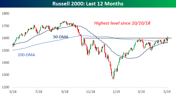
Even more encouraging was the rally in the small-cap Russell 2000, which finally broke above resistance to close at its highest level since October. Traders often look to small caps for confirmation of a rally, and while we think they are often given more importance than they deserve, their outperformance this week doesn’t hurt.
We have a lot more to cover this week, including updates on some of the key leadership groups/indicators, drivers of the market’s strength in April, how earnings season is progressing so far, how the economy is faring, and the state of consumer sentiment, among other things. To read our full Bespoke Report newsletter and access everything else Bespoke’s research platform has to offer, start a two-week free trial to one of our three membership levels. You won’t be disappointed!

Churchill Downs (CHDN) Off To The Races?
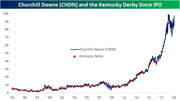
The “Fastest Two Minutes in Sports” is on Saturday at Churchill Downs in Kentucky. Since the founding of the race and racetrack (in which the company draws its name) in 1875, Churchill Downs Incorporated (CHDN) has branched out to a number of other lines of business including ownership of other race tracks and casinos around the US in addition to online gambling sites. CHDN has been like Secretariat over the last decade, posting a “10-bagger” by rising more than 10x in value since its low in 2009.
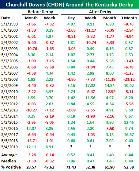
So how does the stock perform around “Derby Day” specifically? In the past 20 years, the period leading up to the Kentucky Derby has typically been pretty shaky for the stock with declines in the month and week leading up to the race. Historically, in the month before the derby, CHDN has only risen 28.57% of the time with an average decline of 2.26%. The week before has been slightly better, but still declines over half the time. This year bucked the trend, though, with the stock rising 12.11% over the past month and 6.91% in the past week; similar to 2016.
Looking forward, returns have typically been positive in trading the Monday after the Kentucky Derby with a gain averaging 0.52%. Both one week and three months after, outperformance is similar rising 0.41% and 0.44%, respectively, on average. Both have also been positive only a little more than half the time. One month out has been a little stronger as CHDN has been more consistently positive, rising 61.9% of the time, and averaging a 1.4% gain.
Fortunately, recent history points to a bit more of an optimistic outlook. Many of the declines occurred in the 90’s and pre-crisis era. In the current bull run, the stock has only been lower one month out three times and only twice 3 months out. One final note, the company has typically reported their Q1 earnings around this time (sometimes even the trading day before or after the derby) . In other words, performance at this time of year is not purely a factor of the race as earnings also can have a significant impact. Start a two-week free trial to Bespoke Institutional to access our interactive Earnings Database, Seasonality Tools, and much more.
Beyond Meat (BYND) Brings Home The Bacon
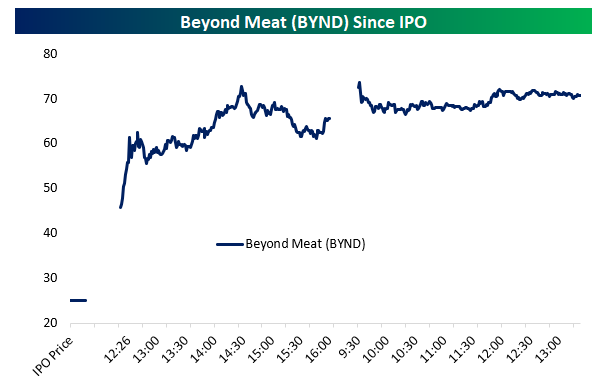
Yesterday Beyond Meat (BYND) IPO’d at $25/share, valuing the business at about $1.5bn versus trailing 12-month revenues of less than $70mm. The company has been operating in VC-funded private markets for a long time, developing meat alternatives appealing to the health conscious, climate-concerned, and animal welfare-oriented consumer base that wants “meat” without some of its negative externalities. While the pricing of the IPO sounds aggressive, price action since has been extreme. The stock has surged more than 180% from its IPO price, trading in the low-$70 range and holding opening day gains as-of this writing.
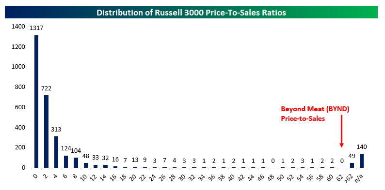
The nose-bleed 60.9x price-to-sales ratio BYND now carries sounds absolutely ridiculous, but there are actually 49 companies in the Russell 3000 with a more aggressive valuation and another 140 for which data is not available. Obviously, BYND’s valuation relative to its sales is extremely aggressive, but given its long history in the private markets, describing it as an extremely high-growth company isn’t without precedent among current listed stocks in the US.
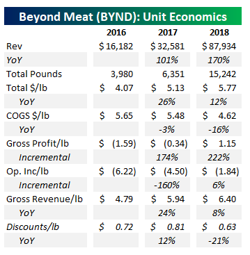
While it’s hard to get excited about a stock that has so much optimism priced in already, we should note that BYND’s economics don’t actually look as bad as some other IPOs and businesses we have come across. This is a real business, with real demand, what appears to be pricing power, and potential to grow very profitably. In the table below, we show annual data from Beyond Meat’s S1. Revenue has more than doubled the last two years, with the volume of meat substitute products rising by almost 5x in two years. As the company has scaled up its product offering, it has raised prices from an average net of $4.07 per pound to more than $5.70 per pound. At the same time, it has reduced discounting from 81 cents per pound in 2017 to 63 cents per pound this year.
On top of raised prices, the company has been able to reduce the cost of goods sold per pound, falling from $5.65 in 2016 to $4.62 today (down 16% YoY). Those positive economies of scale suggest that strong revenue growth will feed through to increasing profit margins. So far, that’s what’s happened: for each pound sold in 2016, BYND lost $1.59 on a gross basis, but gross profits rose by $1.74 for each additional pound sold in 2017 and by $2.22 cents per pound from 2017 to 2018. That’s led to gross profits of $1.15 per pound in 2018, and operating losses of $1.84 per pound in 2018. While the company used to lose money on each additional pond ($1.60 from 2016 to 2017), incremental pounds sold generated 6 cents of operating income per pound from 2017 to 2018. Assuming the company can keep up sales momentum and reduce costs across that higher volume, profitability is very attainable.
One last point on the BYND IPO: it’s part of a boom in average gain on the first day of trading. In the chart below we show the rolling three month average gain from IPO price to first close since 1995. The tech bubble really stands out on this chart! The average IPO went from a ~20% pop in the late 1990s to more than doubling! After 2001, pops returned to a much more normal 10-20% range, with some brief drops into negative territory during 2008, 2010, and 2016. With the most recent round of IPOs, though, we’ve seen the return of high average pops, and the current rolling three month average has shot up to nearly 30%. That’s the highest since the tech bubble, and highest for any period other than the tech bubble since 1995. So far, we’ve been pretty skeptical of claims that we’re in the same sort of period of market excess as the tech bubble (see “Best and Worst Performing IPOs” from April 23rd, link). This is one indicator, though, that points to the current IPO market being a little too hot. Other indicators, as discussed in that prior post, aren’t sending the same signal…for now, at least. Start a two-week free trial to Bespoke Premium to access our interactive earnings database and much more.

Mutual Fund Flows: A Tale of Two Asset Classes
Earlier this week the Investment Company Institute (ICI) reported mutual fund flows for the week ending April 24. The results were grim for the equity mutual fund industry, as they have been for a very long time. In the chart below we show dollar flows by mutual fund type across a variety of time periods. Notably, equity funds are extremely weak across almost all fund types, with emerging markets equity funds the only exception. The complete opposite is true of bond mutual funds. While equity funds saw outflows of $13.9bn over the course of the week, bond funds saw inflows of more than $10bn, driven by investment grade bonds. Start a two-week free trial to Bespoke Premium to access our interactive economic indicators monitor and much more.
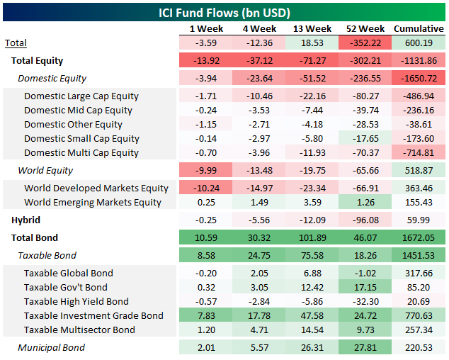
Arbitrary large dollar numbers can be a bit hard to get a grasp of, so we also like to look at fund flows on a percentile basis, comparing their size to historical ranges. Higher numbers indicate larger fund inflows, or smaller outflows, while lower numbers indicate larger fund outflows or smaller fund inflows. This table ultimately tells the same story as the table above: very large outflows relative to history for equities, very large inflows relative to history for bonds. As with EM equities, there are exceptions to the bond inflow story: high yield has been relatively weak persistently of late. But generally speaking, fund inflows to bonds have been very large for a while now.

In the chart below we show cumulative fund flows for all US mutual funds, all equity mutual funds, and all bond funds. As shown, while equity fund flows haven’t been universally negative since 2007 (2013-2015 saw notable inflows), the general trend has been the same for the past decade and counting: redemptions from equity funds, buying of bond funds.
Alphabet (GOOGL) Technical Issues
Below is a snapshot of GOOGL’s price chart from our Security Analysis page. Right before reporting earnings on Monday after the close, GOOGL made a fresh all-time high by barely eclipsing levels seen in mid-2018. The stock cratered after hours on Monday and opened sharply lower on Tuesday morning. This gap lower left shares below the steep uptrend channel that formed off the stock’s late 2018 low. Now the stock is in somewhat of a no-man’s land, and we’d expect meandering performance in the coming weeks as it tries to regain its footing. Start a two-week free trial to Bespoke Institutional to access our Security Analysis page and everything else we offer.

China ASHR ETF Dips Below 50-DMA
Chinese equity markets have been closed since Tuesday, but the ASHR ETF that tracks onshore China and trades on US exchanges has been trading, and yesterday it closed just below its 50-day moving average. This break below the 50-DMA is seen as a negative technical formation, but we’ll be watching it closely today to see how it closes out the week. Note that our trend algo still tags ASHR as being in an uptrend, and the sell-off over the last two weeks now leaves it with a “good” timing score. Start a two-week free trial to Bespoke Institutional to access our Security Analysis page and everything else we offer.

Bullish Sentiment On The Rise
As the S&P 500 has been making all-time highs in the past week, bullish sentiment as reported by the AAII Investor Sentiment Survey has risen back up to its highest levels since the start of April. The percentage of investors reporting an optimistic outlook rose to 39.02% from 33.52% last week. This is still only slightly above the historical average; so it is not at an alarming level. Alongside the solid increase in AAII’s reading, Investors Intelligence sentiment readings are echoing the optimistic shift as the percentage reporting as bulls rose to its highest level since early October of last year.
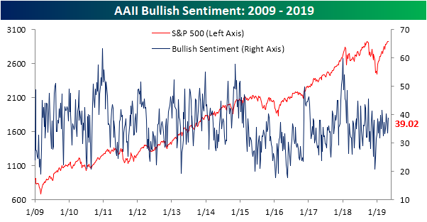
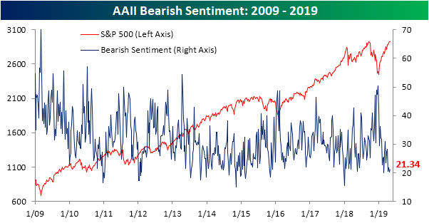
Bearish sentiment also rose 1.2% to 21.3% this week. In the grand scheme of things, though, even with this increase bearish sentiment still remains at very low levels. As with bullish sentiment, the Investors Intelligence survey results are similar to the AAII survey as bearish sentiment also fell to multi-month lows.
Neutral sentiment, on the other hand, saw a sharp decline this week falling to 39.63% from 46.31% last week. That is the largest decline since the final week of 2018 when the market bottomed and a very large portion of investors reported outright bearish sentiment. This time around, the decline in neutral sentiment predominantly went towards the bulls. Start a two-week free trial to Bespoke Premium to access our interactive economic indicators monitor and much more.

ISM Internals Weaker Than Headline
On Wednesday, the Institute for Supply Management (ISM) released its monthly snapshot of US manufacturing in the form of its Purchasing Manager Index. The index reports manufacturers’ activity on a variety of different metrics, creating an overall activity composite for the headline index. In the chart below, we compare the headline index to another series created with two sub-indices of the composite data. Generally speaking, manufacturers report strong activity when new orders are rising faster than inventories. The two series aren’t perfectly correlated, but over time they tend to move together, with the relationship between new orders and inventories typically leading the overall index. As shown in the chart, the New Orders-Inventories spread is at the weakest level since the end of 2012, and is much, much weaker than the headline index. That suggests the recent decline in this measure of manufacturing activity isn’t over yet. Start a two-week free trial to Bespoke Premium to access our interactive economic indicators monitor and much more.
US Equity Guidance: A Proxy For Global Growth
It shouldn’t be a big surprise, but our data shows US corporate management teams are sensitive to global growth. In the chart below, we compare the US equity market’s guidance spread to Markit’s Global Manufacturing PMI. The guidance spread measures the percentage of companies raising guidance each month to the percentage of companies lowering guidance each month. Higher readings indicate more guidance raises relative to lowers, and therefore optimism from management teams about the outlook. We’ve taken the raw monthly percentage, seasonally adjusted it, and taken a 3 month average to compare to ISM. As shown, big upswings or downswings in guidance tend to coincide with similar swings in global manufacturing activity as measured by Markit’s PMI. Currently, we’re in the midst of a swing lower for both, but things are still actually more positive than numerous periods from 2012-2016.
Start a two-week free trial to Bespoke Premium to access our interactive economic indicators monitor and much more.