0 to 55 in Seven Days
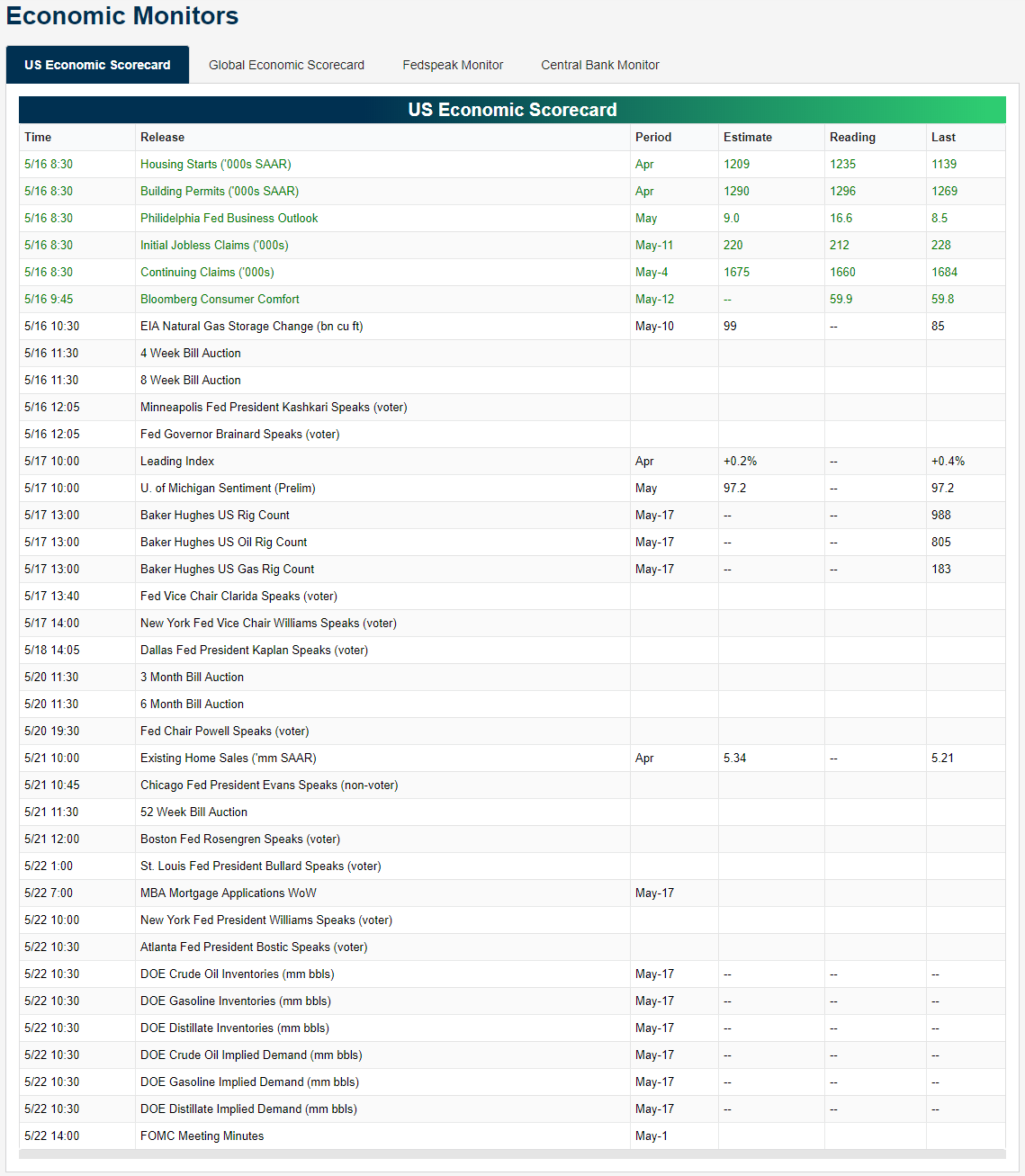
In a post last Friday, we noted that based on our Stock Seasonality tool, the S&P 500 was entering what has historically been its weakest seven-day stretch of the calendar year. That’s right, over the last ten years, the S&P 500 has been down in the one week period from the close on 5/10 through 5/17 by a median of 1.78% with declines eight out of ten times. The image below is from the post last Friday and shows how in the one-week period, our gauge of performance for the S&P 500 was all the way down to zero, meaning it doesn’t get any worse than that! When the market opened on Monday morning it was looking like another mid-May week from hell as the S&P 500 gapped down sharply on trade fears. In a pretty impressive turnaround, though, bulls clawed their way back and the S&P 500 was only down modestly on the week as of Friday afternoon.
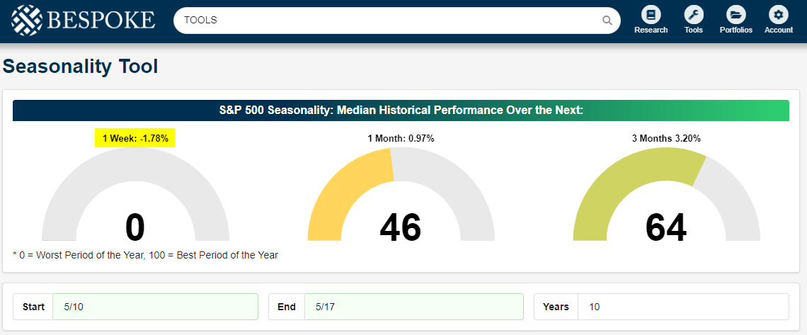
So now that we have gotten through ‘hell week’ for the market, what can we expect next week? Below we show the updated gauges for the S&P 500’s historical performance over the next week, month, and three months (from the close on 5/17). While the week of 5/10 through 5/17 has typically been horrible, the week that follows has historically been slightly above average with the S&P 500 posting a median gain of 0.37%, which ranks in the 55th percentile of all 7-day periods throughout the year. Looking further out than a week, returns improve from there. The S&P 500’s median return one month after the close on 5/17 is a gain of 1.84% (71st percentile), and the median three-month return is a gain of 3.86%, which is better than 75% of all other one week periods throughout the calendar year. Now, if you want to find the stocks that have historically performed best during this period of the year, head on over to the Stock Seasonality tool for more info. If you are not currently a Bespoke Premium client, start a two-week free trial today for immediate access.
B.I.G. Tips – Earnings Season Summary and Top Triple Plays
We’ve just published a B.I.G. Tips report that provides a full summary of the just-completed earnings season along with the newest edition of our Top Triple Plays. This season we identified 22 earnings triple plays that have attractive price charts right now.
What is a triple play? When a stock reports quarterly earnings, it registers a “triple play” when it beats analyst EPS estimates, beats analyst revenue estimates, and raises forward guidance. We coined the term back in the mid-2000s, and you can read more about it at Investopedia.com. We consider triple plays to be the cream of the crop of earnings season, and we’re constantly finding new long-term buy opportunities from this basket of names each quarter. You can track the newest earnings triple plays on a daily basis at our Triple Plays page if you’re a Bespoke Premium or Bespoke Institutional member. To read our newest report and see the triple plays that we think look the best right now, start a two-week free trial to Bespoke Premium!

Consumer Expectations Surge
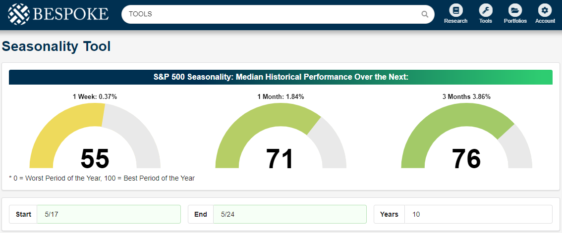
After a strong slate of economic data on Thursday, today’s data continued the positive trend with a much stronger than expected sentiment report from the University of Michigan where the headline index came in at its highest level since January 2004. While economists were forecasting the index to come in at a level of 97.2, the actual reading was much stronger at 102.4. That beat relative to expectations was the biggest since October 2017. The big driver of this month’s strength was the fact that the expectations component surged 8.6 points to 96.0 from 87.4. Over the last few years, the expectations component of the UMich Sentiment report has tried unsuccessfully to break above 90, but this month it blew right through that level to the highest levels of the current economic cycle.
Not only did the expectations component make new highs relative to the last few years, but it’s also at levels not seen in over 15 years. The fact that this index is making new highs is an encouraging one as it indicates confidence about the future, and with the number of Americans feeling like they are living ‘paycheck to paycheck‘ at multi-year lows, how can you blame them?

The one head-scratcher? It’s a bit counter-intuitive to see consumer sentiment and the probability of rate cuts from the FOMC so high at the same time! Start a two-week free trial to Bespoke Institutional to access our interactive economic indicators monitor and much more.

Morning Lineup – Oh Deere
Futures are indicating a lower close for equities to end the week, and a big reason for that decline is the latest earnings report from Deere (DE). In addition to missing EPS forecasts by 11 cents (3.52 vs 3.63), DE also lowered guidance. The company summed up the factors affecting its impact with the statement that, “Ongoing concerns about export market access, near-term demand for commodities such as soybeans, and a delayed planting season in much of North America are causing farmers to become much more cautious about making major purchases.” Trade and weather.
In other earnings news, Nvidia (NVDA) is trading modestly lower after initially seeing a very positive reaction to earnings in after-hours trading on Thursday, while Applied Materials (AMAT) is trading higher after a strong report. Finally, Pinterest (PINS) is down over 17% in the pre-market after reporting a wider than expected loss and lowering guidance in its first earnings report as a public company. Rule #1 for IPOs, for at least your first earnings report as a public company, it’s a good idea to manage street expectations well enough so that you don’t come in weaker.
We’ve just published today’s Morning Lineup featuring all the news and market indicators you need to know ahead of the trading day.

The term ‘stock-picker’s market’ has become a bit of a cliche in stock market conversation, but looking at where sectors are currently trading relative to their trading ranges shows that the term is especially applicable right now. While the S&P 500 is essentially right at its 50-day moving average, sectors are pretty much evenly split between trading above and below that level. At the extremes, Consumer Staples is the only overbought sector while Energy is the lone sector in oversold territory.

Start a two-week free trial to Bespoke Premium to see today’s full Morning Lineup report. You’ll receive it in your inbox each morning an hour before the open to get your trading day started.
The Closer — Starts, Freights, Five Fed — 5/16/19
Log-in here if you’re a member with access to the Closer.
Looking for deeper insight on markets? In tonight’s Closer sent to Bespoke Institutional clients, we show equities ripping out of their short term downtrend as the S&P 500 also took out its 50-DMA. We also provide the performance of similar times this has happened. We also highlight concerns around commodities before turning to economic data, taking a look under the hood at housing starts and permits in addition to Cass Freight volumes. We finish tonight with an update of our Five Fed Manufacturing Composite.

See today’s post-market Closer and everything else Bespoke publishes by starting a 14-day free trial to Bespoke Institutional today!
Golden and Death Crosses: Two Examples
Our Chart Scanner Tool has become an incredibly popular and useful tool for clients as it gives a user the ability to quickly scan through hundreds of charts in order to find the most attractive (or unattractive) patterns. Included with the tool are a number of pre-defined screens that allow users to see stocks that hit 52-week highs or lows in the previous session or experienced “death” or “golden” crosses.
A Golden Cross occurs when a stock’s upwardly sloping 50-day moving average (DMA) crosses above its 200-DMA, which also has to be rising. Conversely, a Death Cross occurs when a downwardly sloping 50-DMA crosses below the 200-DMA, which also has to be moving lower. Technicians consider Golden Cross formations to be a positive signal, while a Death Cross is considered to be negative. Although it is valuable to look at Golden and Death Cross formations, as we have pointed out in the past, it is not always a reliable pattern and does not always serve as a good buy or sell signal. Today, we wanted to highlight recent examples of each formation and show how they performed going forward
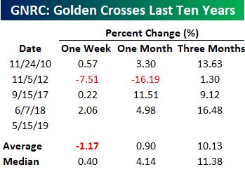
As an example of a Golden Cross, below we highlight Generac Holdings (GNRC) which saw a Golden Cross yesterday. GNRC makes home generators and has seen steady growth as concerns over the reliability of the power grid have increased in recent years. Over the last ten years, GNRC has shown consistently positive returns in the three month period following its four prior golden crosses. As you can see below, the stock’s average three-month return has been a gain of 10.13% (median: 11.38%).

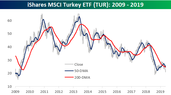
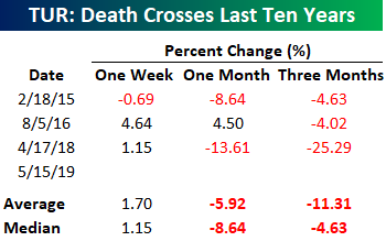
On the negative side, below we highlight the price chart of the iShares MSCI Turkey ETF (TUR) from 2009 to 2019. Turkey has been a country in turmoil in recent years, and prior death crosses in TUR have played out as the formation suggests. In the three prior death crosses for the ETF, the stock has declined over the following three months for an average decline of 11.31% (median: -4.63%).Our Chart Scanner tool is indispensable for any investor who likes to follow charts. To receive access, start a two-week free trial to Bespoke Institutional for full access.
Back to Bearish
Tariff headlines have taken a front seat in the past couple of weeks leading stocks to see their worst declines of the year. Not surprisingly, sentiment has begun to reflect price action. One week after coming in at its highest level since October (around the time the S&P 500 hit its previous all-time high), bullish sentiment has fallen off of a cliff this week to 29.82% versus 43.12% last week. From a historical perspective, this is not at any kind of extreme, but it did bring optimism to its lowest level of 2019 and by a pretty wide margin at that. Additionally, this was the largest drop in bullish sentiment since December 13th of last year when it fell 17.04% in a week. Start a two-week free trial to Bespoke Institutional to access our interactive economic indicators monitor and much more.
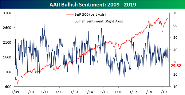
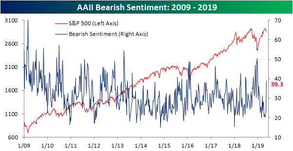
Bears have overtaken the bulls this week as the bull-bear spread is now negative for the first time since January 17th. Bearish sentiment spiked up to 39.3% from 23.19% last week. While this was a massive spike higher, it is still well off of any sort of extreme and we actually saw higher readings late last year. Investors Intelligence is echoing the AAII results as that survey showed the highest percentage of respondents since February (31.1%) expecting a correction. Granted, bearish sentiment in this survey remains muted as it actually fell to its lowest level since April of last year.
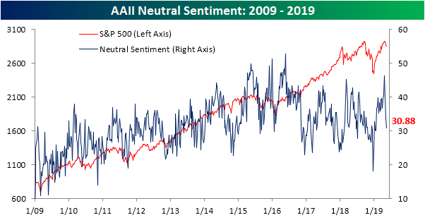
Tanking to 30.88%, it is hard to still say neutral sentiment is still elevated after peaking four weeks ago when it hit 46.31%. This represents the sharpest four-week declines in neutral sentiment 1/23/16 when it fell 15.71 percentage points (from 51.31% to 29.77%). Currently, neutral sentiment is sitting less than a percentage point below its historical average.
Bespoke’s Sector Snapshot — On Much Firmer Ground
We’ve just released our weekly Sector Snapshot report (see a sample here) for Bespoke Premium and Bespoke Institutional members. Please log-in here to view the report if you’re already a member. If you’re not yet a subscriber and would like to see the report, please start a two-week free trial to Bespoke Premium now.
In this week’s Sector Snapshot, we analyze the market’s big bounce back from a 2%+ decline on Monday as well as Tech’s relative outperformance versus Health Care lately.
To gain access to the report, please start a two-week free trial to our Bespoke Premium package now. Here’s a breakdown of the products you’ll receive.
More – But A Little Less – Of The Same From Mutual Fund Flows
Yesteday the Investment Company Institute (ICI) released weekly mutual fund flows for the week ending May 8th. Generally speaking, recent trends of huge outlfows from equity mutual funds and huge inflows to bond mutual funds have continued, with a few exceptions. Domestic large cap equities saw an inflow (their first in the past sixteen weeks), as did both emerging and developed market equity funds focused on international markets. High yield bond funds continued to see outflows, and flows into both global and domestic government bonds slowed. Muni bonds also continued to get huge flows, with one week flows in the 96th percentile of all periods. Start a two-week free trial to Bespoke Institutional to access our interactive economic indicators monitor and much more.