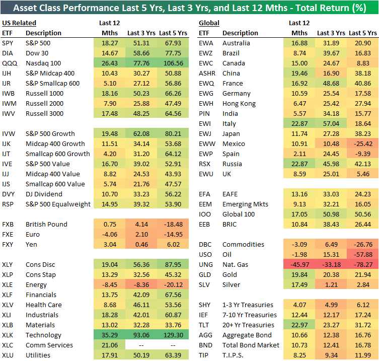
12 Month, 3 Year, and 5 Year Asset Class Total Returns
The table below shows the total returns of various asset classes over the last twelve months, three years, and five years using key ETFs traded on US exchanges.
The US Technology sector (XLK) has posted the strongest returns over all three time periods, with a 35.29% gain over the last year, a 93.06% gain over the last three years, and a 129.3% gain over the last five years. Looking at other sectors, Consumer Discretionary (XLY) has been the second best performer behind Tech over the three and five year time frames, while the new Communication Services sector (XLC) has been the second best over the last twelve months.
On the negative side, the US Energy sector (XLE) is down on a total return basis over all three time frames. Energy is down 8.45% over the last year, 8.36% over the last three years, and 20.12% over the last five years. That’s how a sector goes from having an S&P 500 weighting of 9% five years ago to a weighting of just over 4% now!
Large-cap growth has been the best factor ETF over all three time frames by a large margin. The S&P 500 Growth ETF (IVW) is up 80.21% over the last five years. The next best of the size/strategy ETFs in our matrix has been Smallcap Growth (IJT) with a five-year total return of 64.12%. On the other hand, Midcap Value (IJJ) has been the weakest factor ETF with a five-year gain of 43.93%.
Internationally, no country ETF in our matrix comes close to the 67.93% gain that the S&P 500 (SPY) has seen over the last five years. Russia (RSX) has been the best of the country ETFs over the five-year time frame with a gain of 42.13%, while France (EWQ), Japan (EWJ), and China (ASHR) rank second through fourth with gains between 38-40%. Mexico (EWW) and Spain (EWP) are both down over the last five years, while countries like the UK (EWU) and Canada (EWC) are only up by single-digit percentage points.
Over the last year, it’s a slightly different story with three countries (China, Italy, Russia) outperforming the S&P 500’s 18.27% gain. Spain (EWP) has been the weakest country over the last year gaining just 2.11%.
The broad commodities ETF (DBC) has been terribly weak versus other asset classes over all three time frames. DBC is down 3.09% over the last year, up just 6.49% over the last three years, and down 26.76% over the last five years. Most of the pain for commodities has been due to oil and natural gas price weakness. The oil ETF (USO) is down 57.88% over the last five years while the natural gas ETF (UNG) is down 78.27%! Gold (GLD) has been a positive outlier for commodities with gains of roughly 20% over each of the three time frames.
Finally, fixed income ETFs have posted very strong returns given their risk averse characteristics. The widely followed 20+ Year Treasury ETF (TLT) is up 22.97% over the last 12 months, which is 4.7 percentage points better than the S&P 500 over the same time frame! Sign up for Bespoke’s “2020” special and get our upcoming Bespoke Report 2020 Market Outlook and Investor Toolkit.
Which of These Sectors is Not Like the Other
The S&P 500 is right at all-time highs, but if you look at your portfolio or a random list of stocks, with some of the winners there are bound to be some clunkers. Before getting too restless, though, it’s important to keep in mind that not all stocks rally or decline in unison with each other. The chart below perfectly illustrates this. In it, we show the average distance that stocks in the S&P 1500 are trading with respect to their 52-week highs. For the S&P 1500 as a whole, stocks in the index are collectively trading an average of 16.2% from their respective 52-week highs. Large-cap stocks in the S&P 500 are the closest to 52-week highs at just a hair above 10%. Mid Caps are down an average of 14.8% while small caps have been the big laggard with stocks in the S&P 600 down an average of 22.2% from their 52-week highs.

Small-cap stocks have been a laggard for the last year, and one of the key drivers of that weakness has been the Energy sector. The chart below shows how far stocks in the S&P 1500 are trading relative to their 52-week highs broken out by sector. It’s not often that you see one sector as such a big outlier relative to all the others, but the Energy sector is in a league of its own these days. Stocks in the sector are more depressed than any other, trading down an average of 42.8% from their 52-week highs. Behind Energy, the next closest sector is Communication Services at an average of 22.7%. That’s a spread of more than 20 percentage points between the two sectors with stocks furthest below their 52-week highs!
While stocks in the Energy and Communication Services sectors are the furthest below their 52-week highs, sectors that are the closest include Utilities and Financials where the average stock in each sector is down less than 10% from their 52-week highs. Sign up for Bespoke’s “2020” special and get our upcoming Bespoke Report 2020 Market Outlook and Investor Toolkit.

Bespoke’s Morning Lineup – 11/19/19 – Retail Wreck
See what’s driving market performance around the world in today’s Morning Lineup. Bespoke’s Morning Lineup is the best way to start your trading day. Read it now by starting a two-week free trial to Bespoke Premium. CLICK HERE to learn more and start your free trial.

The Closer – WeWorked Over, Breadth Bolting, Intraday Rallies, Commodities – 11/18/19
Log-in here if you’re a member with access to the Closer.
Looking for deeper insight on markets? In tonight’s Closer sent to Bespoke Institutional clients, we begin with a review of WeWork’s bonds and the technical strength of equities’ rally including the increasingly long streak of days with open to close gains. Turning away from stocks’ strength, we then take a look at the weakness in commodities. We then move onto economic data including the negative shift of Citi Economic Surprise Indices and a summary of today’s TIC Flows release.

See today’s post-market Closer and everything else Bespoke publishes by starting a 14-day free trial to Bespoke Institutional today!
Chart of the Day: Risk Appetite Spikes
Dreaming of Better Returns
What could be called the software industry’s annual version of Woodstock kicks off tomorrow when salesforce.com (CRM) begins its annual Dreamforce event. The event is held each year at some point between September and December and is widely considered the largest tech industry conference in the world. While Dreamforce tends to shine as favorable a light as possible on salesforce.com, the conference hasn’t always been a good time for the company’s stock price.
The chart below shows the performance of CRM’s stock from the closing price the day before the event kicks off through the close on the conference’s last day. Over the last 15 years, shares of CRM have seen an average decline of 0.75% (median: -1.45%) during the four-day conference with positive returns just under half of the time. While the overall average returns haven’t been particularly good, we would note that things have started to get better for the stock during this conference with gains in each of the last four years. Even here, though, three of those four years saw gains of less than 1%. Sign up for Bespoke’s “2020” special and get our upcoming Bespoke Report 2020 Market Outlook and Investor Toolkit.

This Week’s Economic Indicators – 11/18/19
Despite the move in equities to all-time highs, recent economic data has had a tinge of weakness. Of the 25 releases last week, 13 came in worse than expected or the previous reading while 9 were stronger. The remainder matched expectations or were unchanged. Due to the Veterans Day holiday shuttering government agencies and many other organizations in the US on Monday, the first release of the week, and sole release on Tuesday was the NFIB’s Small Business Optimism. The index rose to 102.4 from 101.8, exceeding expectations of a rise to 102. Activity picked up on Wednesday with CPI and the monthly budget statement. While headline CPI rose more than expected at 1.8% MoM, core measures weakened. Likewise, PPI (released the following day) was stronger at the headline level, but the core measure taking out food, energy, and trade services was weaker than the September print. Labor data was mixed this week with initial jobless claims coming in at a recent high while continuing claims met expectations. Real average hourly earnings were unchanged. Friday was the busiest day with Empire Manufacturing, retail sales, and industrial production. Most of this manufacturing data was worse than expected with the exception of manufacturing production. Granted, it still contracted -0.6% MoM which was still worse than the -0.5% in September.

Turning over to this week, the calendar is a bit light with just 17 releases scattered throughout the week. It will be a busy week for housing data with homebuilder sentiment leading off today. Data on housing starts, permits, mortgage applications, and existing home sales all follow up later in the week. In manufacturing, we will get the next two regional fed indices from the Philly Fed and Kansas City. On Friday, we will also get preliminary November Markit PMIs. Start a two-week free trial to Bespoke Institutional to access our interactive economic indicators monitor and much more.

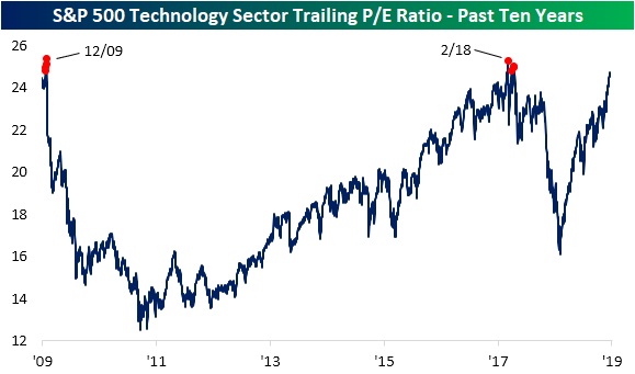
Technology Sector Valuation Has Gotten Elevated
Bespoke’s Daily Sector Snapshot (view sample here) is a popular one-page report that subscribers use to stay on top of sector themes. One data point that has stood out recently is where valuations stand within their historical ranges (past ten years). As shown below, the only sector with a current valuation that’s in the bottom half of its range over the last ten years is Financials. Every other sector is currently trading with a valuation above the 60th percentile.
Utilities and Technology are currently extremely elevated in the 97th and 99th percentiles, respectively. The trailing price-to-earnings ratios for Consumer Discretionary and Communication Services are also in the top 10% of all days of the past 10 years. Finally, the S&P 500 as a whole has a current P/E that is higher than 89.1% of all readings over the last ten years.

The chart below shows the Technology sector’s trailing price-to-earnings ratio over the past ten years. In the time since the dramatic sell-off around this time last year, valuations have more than recovered rising from a low of 16.11x earnings on January 3rd to 24.75 on Friday. In the chart below, the red dots indicate the only times that Tech had a higher P/E than now over the last ten years. As shown, in the past decade there have only been a handful of times, just nine trading days in fact, that the Tech sector’s P/E ratio moved above 24.75; 0.4% of all days in that time frame. Those days came in two pockets. One in February and March of last year and the other in late December of 2009. While Tech is at a premium compared to the past decade, it is still well off of levels from the late 1990’s/early 2000’s around the time of the tech bubble. The current valuation would need to more than triple to reach the 1999 peak of 82.62x earnings. Start a two-week free trial to Bespoke Institutional to access our Daily Sector Snapshot and much more.
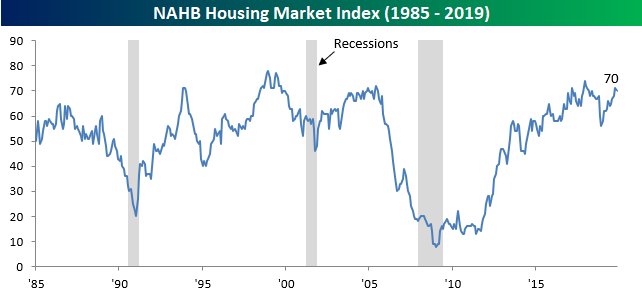
Homebuilder Sentiment Cools
After its largest ten-month increase in more than six years, homebuilder sentiment unexpectedly cooled in November. According to the NAHB, while overall homebuilder sentiment was expected to remain unchanged, the headline index actually declined from 71 down to 70. While this month’s sentiment report was slightly weaker than expected (economists were expecting a reading of 71), the modest decline should not come as too much of a surprise given the large uptick in long-term rates since the last report.
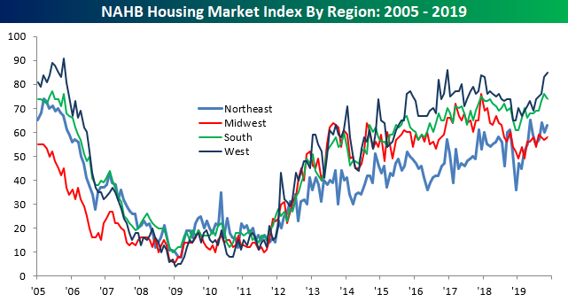
The table below breaks down this month’s report by various factors as well as on a regional basis. While both Present Sales and Traffic were down, sentiment towards Future Sales actually increased slightly, and at the current level of 77 is not far from its high in early 2018.

While sentiment was down on a national level, the only area of the country where sentiment was down was in the South where optimism had been at its highest level in more than ten years. Outside of the South, sentiment was actually higher in every other region, including the Northeast and West where sentiment is right near ten years highs. Sign up for Bespoke’s “2020” special and get our upcoming Bespoke Report 2020 Market Outlook and Investor Toolkit.
Dow Adds Another 1,000 Point Notch to Its Belt
While back below that level now, Friday’s close marked the 28th 1,000-point threshold that the DJIA crossed on a closing basis for the first time, and it was the first such cross of one of these thresholds in more than four months. While the financial media used to (and to a degree still does) make a big fuss about the DJIA crossing a 1,000 point level for the first time, these days it just isn’t what it used to be. The table below lists each 1,000 point threshold that the DJIA has crossed in its history. For each level, we also list the date the DJIA first crossed the 1,000 point level, how many days passed since the prior 1,000 point threshold, what percentage that threshold was of the index’s total level, and then how many times the DJIA has crossed above and below that level (on a closing basis).
When we said 1,000 points isn’t what it used to be, we meant it. As shown in the table, these days 1,000 points on the DJIA is only a 3.6% move, and the path from 28K up to 29K will be less than 3.5%. With the DJIA at much higher levels now, the 127-day rally from 27,000 to 28,000 is much less impressive than the 1997 move where the DJIA rallied from 6,000 to 7,000 (a 14% rally) in just 122 days. Additionally, while it took 540 days for the DJIA to go from 26,000 up to 27,000, it only took 421 days for the index to cross the prior eight 1,000 point levels!
Another interesting aspect of the DJIA’s path through 1,000 point thresholds is how many times it crossed each one of them. 10,000 and 11,000 were especially difficult levels for the DJIA to put through the rearview mirror. The index crossed above or below 11,000 on 87 different occasions and 10,000 67 times. While those were extreme levels of congestion for the DJIA, two levels it glided right through were 5,000 and 19,000. These are the only two 1,000 point levels from which the index has never looked back after first crossing above them. Sign up for Bespoke’s “2020” special and get our upcoming Bespoke Report 2020 Market Outlook and Investor Toolkit.
