Health Care Relative Strength
You would think that the Health Care sector (XLV) would be one of the best performing areas of the stock market during a global pandemic. While Health Care was a top performer early on during COVID, the sector has been seriously lagging the broad market lately.
Nothing stands out too much in the price chart (first chart below) of the Health Care ETF (XLV) as it is still in a solid uptrend and in fact making new all-time highs. It’s the chart that compares XLV to the S&P 500 that does stand out. In the second snapshot below, we provide relative strength charts of the eleven major sectors versus the S&P 500. A rising line indicates outperformance versus the broad market while a falling line indicates underperformance. As you can see in the yellow highlighted chart for Health Care, the sector has recently given up all of the gains it made versus the market early on during COVID. From late February through the end of April, Health Care dramatically outperformed, but its relative performance has slowly and steadily trended lower since then. The chart almost looks like the COVID case curve in the NYC region! At this point, the Health Care sector is performing right inline with the S&P 500 over the last year. Bespoke Premium members have access to these sector relative strength charts on a daily basis. You can start a two-week free trial to Bespoke Premium by clicking here.


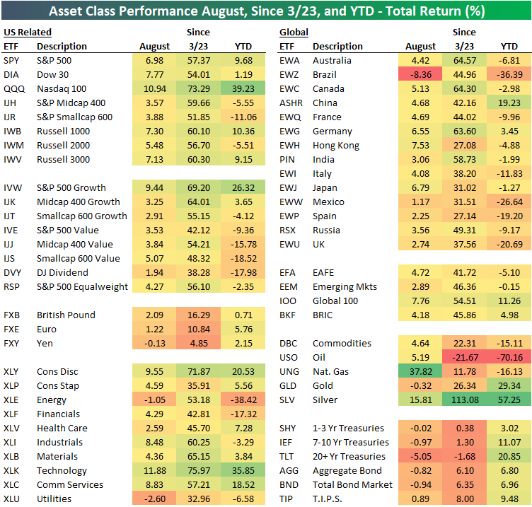
August and YTD Asset Class Performance
Below is a look at the recent performance across asset classes using key ETFs traded on US exchanges. All performance numbers represent total returns. The S&P 500 (SPY) gained 6.98% in August, but the Dow (DIA) and the Nasdaq 100 (QQQ) did even better with gains of 7.77% and 10.94%, respectively. The tech-heavy Nasdaq 100 has been the biggest winner by far across global index ETFs. It’s up 39.23% year-to-date and 73.29% since the March 23rd low made after the COVID Crash.
While everything is up off the March lows, there is wide performance disparity on a year-to-date basis across sectors, size, and themes like value and growth. Large-cap ETFs are now up solidly on the year, while small-cap ETFs like IWM and IJR are still in the red. Mid-cap value (IJJ), small-cap value (IJS), and the Dow Jones Dividend ETF (DVY) are all still down 15%+ on the year.
Looking at sectors, we saw Technology (XLK), Consumer Discretionary (XLY), Industrials (XLI), and Communication Services (XLC) gain 8%+ in August, while Utilities (XLU) and Energy (XLE) both declined during the month. Year-to-date, Tech (XLK) is up 35.9% while Energy (XLE) is down 38.4%.
Outside of the US, every country ETF tracked in our matrix was up in August with the exception of Brazil (EWZ), which actually fell 8.4%. Year-to-date, EWZ is still down 36.4%, while countries like Italy (EWI), Mexico (EWW), Spain (EWP), and the UK (EWU) are down double-digit percentage points as well. Germany (EWG) is the one European country in our matrix that’s up on the year. China (ASHR) is up 19.23%, which is 10 percentage points better than the S&P 500 (SPY).
Commodities have been all over the map in 2020, with the oil ETF (USO) down 70% YTD while silver (SLV) is up 57%. The natural gas ETF (UNG) had a banner August with a gain of nearly 38%, but it’s still down 16% YTD.
Fixed-income ETFs had a rough August as interest rates moved higher, but across the duration spectrum, Treasury ETFs are still up solidly on the year. Click here to view Bespoke’s premium membership options for our best research available.
Bespoke’s Morning Lineup – 9/1/20 – So, Do You Think Splits Still Don’t Really Matter?
See what’s driving market performance around the world in today’s Morning Lineup. Bespoke’s Morning Lineup is the best way to start your trading day. Read it now by starting a two-week free trial to Bespoke Premium. CLICK HERE to learn more and start your free trial.
“Although it’s easy to forget sometimes, a share is not a lottery ticket… it’s part ownership of a business.” – Peter Lynch
With the stock split announcements from Apple (AAPL) and Tesla (TSLA) over the last month, we have been reminded by many market experts that stock splits don’t matter as they have no impact on company fundamentals. That’s obviously true, but tell shareholders or short-sellers of AAPL and TSLA that stock splits don’t matter. Since each company announced their respective stock splits since the end of July, they have seen their market caps increase by a combined roughly $700 billion! AAPL is now bigger than the entire Russell 2000, and Tesla is just one General Motors (GM), or $30 billion, from having a larger market cap than Berkshire Hathaway. AAPL’s market cap has been boosted by a blowout earnings report along with the stock split, but the $190 billion in market cap that TSLA has added has come on essentially no substantive news other than the split.
It’s a new month, but we’re seeing more of the same in markets this morning as the Nasdaq is set to open higher while the DJIA lags. The dollar is lower, and commodities are higher. In economic news, PMI data around the world showed modest increases in August with the majority of countries showing manufacturing gauges in expansion territory.
Be sure to check out today’s Morning Lineup for a rundown of the latest stock-specific news of note, market performance in the US and Europe, economic data out of Europe and Asia, trends related to the COVID-19 outbreak, and much more.

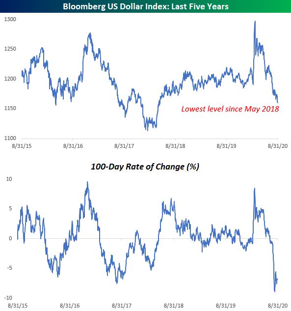
In a month where just about everything went up, the US dollar was lower in August as it has now been for five straight months. This current losing streak is the longest for the US Dollar Index since the six-month period ending in August 2017. Before that only longer streak was a ten-month streak ending in May 2003. Between those two streaks, there were three other five-month losing streaks. In the history of the US Dollar Index, there have only been a total of nine streaks that were longer and eight streaks that were as long. With the Dollar Index already down pretty sharply to kick off September, a six-month losing streak could certainly be in the cards. Better buy those imported goods while you can still afford them!

Daily Sector Snapshot — 8/31/20
Bespoke Market Calendar — September 2020
Please click the image below to view our September 2020 market calendar. This calendar includes the S&P 500’s average percentage change and average intraday chart pattern for each trading day during the upcoming month. It also includes market holidays and options expiration dates plus the dates of key economic indicator releases. Start a two-week free trial to one of Bespoke’s three research levels.

Chart of the Day: Best Five Months in 82 Years
Dollar Down, Everything Else Up
Better spend that dollar in your pocket quickly, because it isn’t worth nearly as much as it was five months ago. In a month where just about every other financial asset went up, the US Dollar couldn’t say the same in August. The Bloomberg US Dollar Index fell for its fifth straight month and traded at its lowest level in more than two years in the process. It was only a few months ago that investors were seeking shelter in the dollar at the onset of the COVID outbreak in the US, but once the Fed flooded the system with liquidity and subsequently pivoted to a much more dovish stance, that rush into the dollar has shifted to an exodus out of it. Earlier this month, the 100-day rate of change in the Bloomberg US Dollar Index (second chart) reached as low as negative 8.9% and still currently sits at -6.8%. Click here to view Bespoke’s premium membership options for our best research available.
Texas Ticking Higher
This morning, the Dallas Fed released their monthly reading on the manufacturing sector. For the first time since February, the index showed an expansionary reading, rising from -3 in July to 8 in August. That is the highest level since February of last year. Meanwhile, the index for the six-month outlook of general business conditions reversed last month’s decline and now stands at 20.4. That is the highest level since November of 2018.

Overall, this month’s report indicated that conditions continued to improve in August with most measures of business expanding rather than in contraction as was the case for the past few months. Breadth was strong with all but one index, Finished Good Inventories, now showing expansionary readings. Breadth in terms of the month over month improvements was not quite as strong though with four different indicators declining.

Two of those indices that fell from July were for Production and Capacity Utilization. Although both were lower in August, these indices are still indicative of expanding (but less so than July) production that is similar to levels prior to the pandemic. Meanwhile, future expectations are still optimistic with the six-month outlook indices for Production and Capacity Utilization at their highest levels since March of last year.
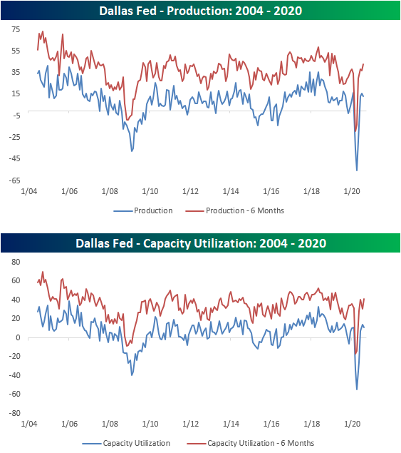
Contrary to companies decelerating production, demand appears to remain strong and improving. New Orders rose to 9.8 which is the highest since January. Not only are new orders rising but they are doing so at a strong pace. New Orders Growth rose to a two year high of 11.8. As a result of stronger demand and weaker production, Unfilled Orders remain elevated around some of the highest levels of the past two years, though, this index did in fact fall slightly from July. Those orders are also getting out the door as Shipments rose to 23.3 which is the highest since August of 2018.

With demand stronger and production pulling back slightly, inventories are at historically low levels as businesses continue to fulfill orders. The index for finished good inventories fell down to -17.3 from -9.9. That is the 17th consecutive month with lower inventories, the second-longest such streak on record behind one that came to a close at 21 weeks in February of 2010, and the lowest reading in over a decade.

Although businesses cut back on production, they did not cut back on their labor force. The index for employment and hours worked both ticked up indicating growth in the number of employees and how long they worked. Employment rose to its highest level since last September and hours worked is now at its highest level since September of 2018. Click here to view Bespoke’s premium membership options for our best research available.

Bespoke Matrix of Economic Indicators – 8/31/20
Our Matrix of Economic Indicators is the perfect summary analysis of the US economy’s momentum. We combine trends across the dozens and dozens of economic indicators in various categories like manufacturing, employment, housing, the consumer, and inflation to provide a directional overview of the economy.
To access our newest Matrix of Economic Indicators, start a two-week free trial to either Bespoke Premium or Bespoke Institutional now!

Travels Stocks Flying High
After a massive surge on earnings, salesforce.com (CRM) finished last week up over 30% on the week which left it as the most overbought stock in the S&P 500 as shown in the snapshot of our Trend Analyzer below. While Technology stocks seeing strong performance has been a staple of the new COVID economy with other strong recent performance and extremely overbought readings from names like Adobe (ADBE) and Microsoft (MSFT), there is another interesting dynamic of the stocks that are currently the most overbought in the index.

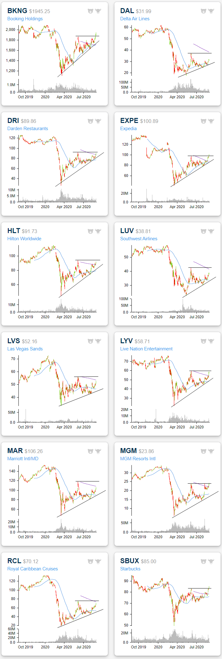
As shown in the snapshot of our Trend Analyzer above as well as in the following table, the 40 most overbought stocks in the S&P 500 have a large representation of re-opening stocks. These names include many travel-related stocks like Expedia (EXPE) and Booking Holdings (BKNG) as well as other travel adjacent names such as hotels and resorts: Marriott (MAR), Hilton (HIL), Las Vegas Sands (LVS), and MGM Resorts (MGM)—Wynn Resorts (WYNN) is not included on the list but just missed as the 41st most overbought stock in the S&P at the moment. Airlines like Alaska Air (ALK) and some restaurants also find themselves in this group of extremely overbought reopening stocks with representations from Darden Restaurants (DRI) and Starbucks (SBUX). As shown, these extreme overbought readings come on double-digit gains for many of these names over the past week alone, and that is on top of already strong performance since the bull market began. Whereas many of these were the hardest hit (in the bottom 50 worst performing stocks) during the bear market running from February 19th to March 23rd, since the new bull market began on March 23rd, some of these same stocks have been the top performers in the index. For example, MGM Resorts was one of the 20 worst performing stocks from 2/19 through 3/23, but since 3/23 it has been the ninth-best performer in the index.

Given that these stocks are currently extremely overbought, this may not pose as the most opportune time to jump in on them, but the charts have been at or approaching interesting levels. In the charts from our Chart Scanner below we show 12 of these stocks. Each one has been in a solid uptrend since the bear market low with highs being put in place back in late spring. With respect to those spring highs, it is a mixed picture. While some stocks like Delta Air Lines (DAL) and Hilton (HIL) have yet to move above those prior highs, others like Booking Holdings (BNKG) and MGM Resorts (MGM) have begun to make new highs. Click here to view Bespoke’s premium membership options for our best research available.