Sector Weight Loss
Since the S&P 500’s last all-time high on September 2nd, the Technology sector has been the hardest hit group having dropped over 13%. As a result of those declines, the sector’s weighting in the S&P 500 has dropped roughly 1.5 percentage points from 28.85% down to 27.35%. In terms of moves in sector weighting over 12-day spans since 1990, that stands in the bottom 2%.
Comparatively, the sector that has taken the next biggest hit in terms of S&P 500 weighting is Communication Services which has fallen a much more modest 0.39 percentage points in that same time. Other than those two, only Consumer Discretionary has also seen its weighting in the index decline. As shown in the chart below, the Technology sector has now erased all of its weight gain from August, and it is back to similar levels from July. Granted, the sector still boasts its highest weighting since the dot com era.

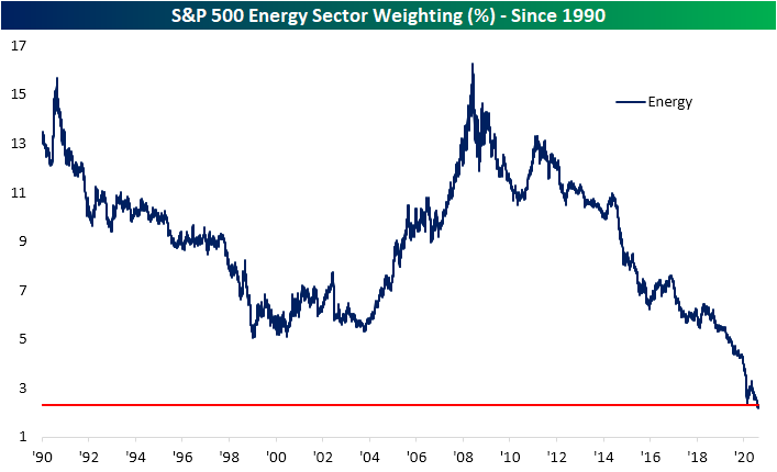
Meanwhile, the Energy sector has been the fourth worst-performing sector since the September 2nd high having fallen over 8%, but it has actually gained weight with its S&P 500 weighting having risen 0.06 percentage points to 2.3%. Inverse to the Technology sector, and granted it was a much less significant move, the Energy sector still has a historically low weighting (2.2%) that is unlike anything observed since at least 1990.
The Financial sector also continues to get smaller and smaller. As shown below, the sector’s current weighting is around its lowest levels of the past three decades. Remarkably, the Financial sector’s weighting is now right around where it was at the lows of the Financial Crisis. Click here to view Bespoke’s premium membership options for our best research available.
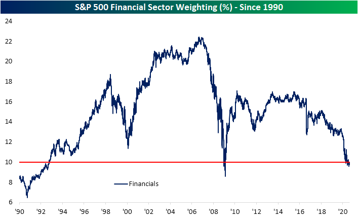
Chart of the Day: Apple (AAPL) Bear Markets
Northeast Still Hanging In There
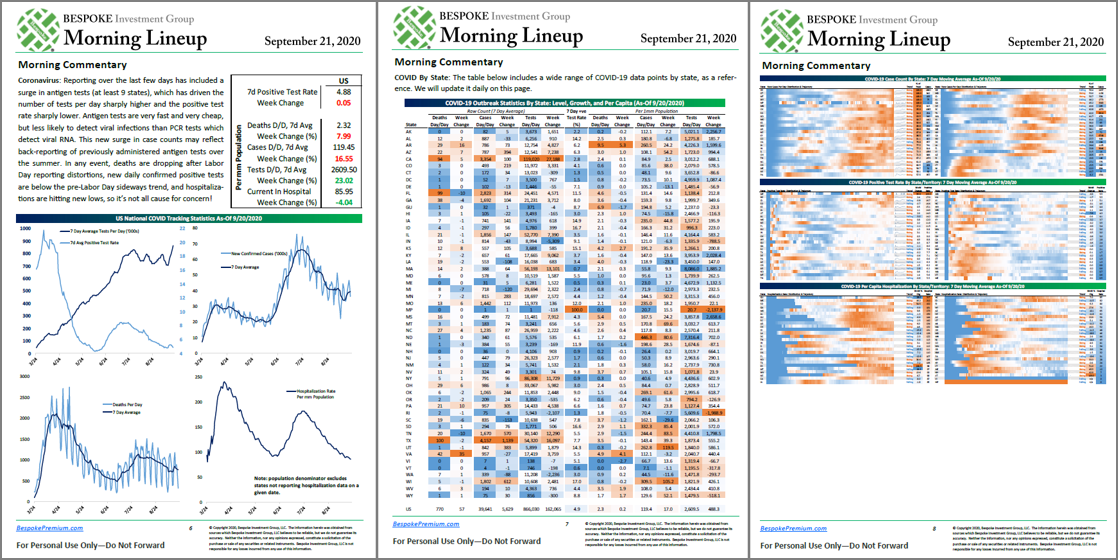
With Europe beginning to see a resurgence in COVID cases, concerns are rising on this side of the Atlantic about a possible bigger wave here as the weather cools. One great way to track the trajectory of the COVID outbreak is in our Morning Lineup each day. In each morning’s report, which is available to Bespoke Premium members, we include three pages of updates on key COVID trends in the US.
On the first page (left image), we include a quick recap of the latest developments as well as a summary chart of the national trends concerning average daily testing, the positivity rate, the number of new cases, and the number of deaths and hospitalizations. The second page (middle image) summarizes the outbreak on a state-by-state level and shows the daily number of deaths, cases, and tests performed each day on an individual state basis. Finally, on the third page (right image), we provide a heat map that shows each state and how the current number of cases in each state compares to that specific state’s peak and whether or not the current trend of positive cases is rising or falling.
Using the data on the third page of our daily summary, we created the map below which shows each state and where their current average daily number of new cases ranks relative to its peak readings since the onset of the outbreak. Looking at the map, it’s interesting to see how the outbreak has progressed throughout the country. While both the coasts and the south now have case counts well below their peak levels, it’s now the middle of the country that is seeing case counts at or near their peak levels. The five states that currently have the fewest number of cases relative to their peak readings (NY, NJ, VY, MA, and CT) are all in the northeast US. Meanwhile, the states where current case counts are either at or near a peak level are in the center of the country.

Looking at the map above, there is a decent amount of red which indicates that many states have case readings that are closer to peaks than troughs. In fact, 17 states currently have caseloads that are at or above 75% of their peak readings while 28 are still above 50% of their peak readings. What’s important to note, though, is that the states currently experiencing the highest caseloads relative to their peaks aren’t major population areas.
The map below shows the percentage of the total US population that each state accounts for. As shown at the bottom, the ten states that currently have the lowest caseloads relative to their peaks collectively account for nearly a quarter of the US population (23.2%), while the ten states that are either at or closest to their peak caseloads account for just 10% of the total population. So while a lot of states are currently seeing rising caseloads relative to their respective peaks, most of these states are small in terms of population. The key areas to watch going forward into the fall are the major population states that each account for at least 5% of the US population like California, Texas, Florida, and New York, and then to a lesser degree states that account for 3%+ of the population like Illinois, Pennsylvania, Ohio, Georgia, North Carolina, and Michigan. As things currently stand, these ten states currently have an average caseload that is more than 50% below their peak levels of the outbreak. Receive our COVID-tracking charts and analysis in your inbox each morning with a two-week free trial to Bespoke Premium.

Bespoke’s Morning Lineup – 9/21/20 – No Joy in Marketville
See what’s driving market performance around the world in today’s Morning Lineup. Bespoke’s Morning Lineup is the best way to start your trading day. Read it now by starting a two-week free trial to Bespoke Premium. CLICK HERE to learn more and start your free trial.
“I want to put a ding in the universe.” – Steve Jobs
2020 has put more than a ding into the universe, and just when you thought things can’t get any more complicated, the world received news Friday night regarding the death of the iconic Supreme Court Justice Ruth Bader Ginsburg. From a purely political perspective, what already promised to be one of if not the craziest, and most politically charged election cycles of our lifetimes only heated up more. Add to that a resurgence of the COVID outbreak in Europe, and it’s looking like another typical September week of declines.
Be sure to check out today’s Morning Lineup for a rundown of the latest stock-specific news of note, market performance in the US and Europe, discussion of the political ramifications of the upcoming SCOTUS fight, trends related to the COVID-19 outbreak, and much more.

The S&P 500 is poised to open down about 1.5% this morning, and below we have summarized the typical performance of SPY from the open to close following downside gaps of 1% or more. On the 64 days since 1994, that these downside gaps have occurred on a Monday, SPY’s median performance from the opening to closing bell has been a gain of 0.02% with positive returns half of the time. In other words, it’s basically a coinflip.

Bespoke Brunch Reads: 9/20/20
Welcome to Bespoke Brunch Reads — a linkfest of the favorite things we read over the past week. The links are mostly market related, but there are some other interesting subjects covered as well. We hope you enjoy the food for thought as a supplement to the research we provide you during the week.
While you’re here, join Bespoke Premium with a 30-day free trial!
California
CME Group to Launch First-Ever Water Futures Based on Nasdaq Veles California Water Index (Nasdaq)
This week the CME Group announced a new futures contract based on the price of water based on the prices traded in California’s five most-active spot water markets. [Link; soft paywall]
California’s wildfires are producing more CO2 than its power plants by Tim McDonnell (Quartz)
In a grim example of the positive feedback loops climate change can create, wildfires on the West Coast have created a larger release of carbon this year than electricity generation in the state for the year. [Link; paywall]
Wacky Wall Street
Citigroup Employee Who Operated QAnon Website on Leave by William Turton and Jennifer Surane (Bloomberg)
A senior IT group manager at Citi was suspended this week when his operation of major sites dedicated to spreading the QAnon conspiracy emerged. [Link; soft paywall]
Reddit’s Stock Threads Become a Must-Read on Wall Street by Sarah Ponczek (Bloomberg)
As frenetic retail trading has become increasingly important on Wall Street, professional investors are increasingly noting what happens on message boards and social media. [Link; soft paywall]
Eating Out
As Demand For Travis Scott Burgers Soars, Some McDonald’s Locations Run Out Of Beef (Restaurant Business)
A punched-up quarter-pounder, fries with barbecue sauce, and a Sprite…not much, but slap some internet celebrity on it and the whole thing has wrecked the MCD supply chain. [Link]
National Restaurant Association report: Pandemic has forced 100,000 restaurant closures in six months by Nancy Luna (Nation’s Restaurant News)
A new survey shows that more than 100,000 restaurants have closed in the last six months, with one in six establishments across the country shuttering; another 40% of operators report they cannot stay open without further relief. [Link]
COVID Leisure
Demand for ‘certified used’ bikes is so strong, some sell above new sticker price by Ethan Wolff-Mann (Yahoo! Finance)
With surging enthusiasm for bikes that can provide safe leisure time amidst the pandemic, second-hand providers are incentivizing new supply…and some customers may be over-paying. [Link; auto-playing video]
Golf and the virus by Myles Udland (I’m Late to This)
Golf’s popularity amidst the pandemic is forcing some very difficult questions about who exactly the golf industry is selling to and why that’s probably not most people. [Link]
Amazon
Amazon Plans to Put 1,000 Warehouses in Neighborhoods by Spencer Soper (Bloomberg/MSN)
With the Everything Store trying to shrink delivery times ever-narrower, expect a lot more logistics close to where customers are, including thousands of new warehouses on the front lines of American consumerism. [Link]
Give It Away
Exclusive: The Billionaire Who Wanted To Die Broke . . . Is Now Officially Broke by Steven Bertoni (Forbes)
The cofounder of Duty Free Shoppers never led an extravagant life, but his effort to give away his fortune is most certainly impressive, painting a stark contrast to other members of the 10 figure club. [Link]
Public Policy
Racial Disparities in the Massachusetts Criminal System by Elizabeth Tsai Bishop, Brook Hopkins, Chijindu Obiofuma, Felix Owusu (Harvard Law School Criminal Justice Policy Program)
A data-first approach to identifying racial inequality in the Massachusetts court system, concluding that differences in the severity of initial charges explains why Black and Latinx defendants have longer sentences; the effect is especially large for drug and weapons charges. [Link; 103 page PDF]
A Bizarre Argument About the COVID Economic Response by Matt Bruenig (People’s Policy Project)
Bespoke’s work has argued in the past that the CARES Act was broadly generous to households and to a lesser extent small businesses, giving out grants to those groups while larger businesses got loans which had to be repaid. But misunderstanding of basic mechanics is leading to a strange argument that loans requiring repayment are somehow more valuable than cash transfers. [Link]
Silver Linings
The southern hemisphere skipped flu season in 2020 (The Economist)
In the Southern Hemisphere, flu season peaks between May and August, but this year there have been barely any cases as efforts to prevent COVID transmission also break flu virus transmission chains. [Link]
Frauds
Nikola (NKLA) admits to faking video of driving prototype in weak response to allegations by Fred Lambert (Electrek)
After a short-seller claimed last week that electric truck company Nikola had engaged in fraudulent behavior, the company delivered a lackluster response that seemed to confirm a number of the allegations. [Link]
Tattooed by Bill Gross (William H Gross)
Without any endorsement, we can’t resist passing on this screed of complaint about a son’s tattoo not-so-well-disguised as an investment letter. [Link; 3 page PDF]
I Want To Believe
Potential sign of alien life detected on inhospitable Venus by Will Dunham (Reuters)
Phosphine gas is only produced by biological life on our planet, which makes its discovery on Venus fascinating; it could signal microbial life even though the planet is widely assume to be unlivable. [Link]
Read Bespoke’s most actionable market research by joining Bespoke Premium today! Get started here.
Have a great weekend!
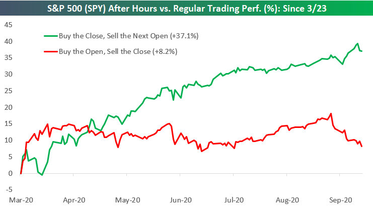
Intraday Selling
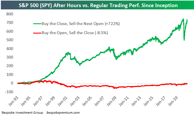
One of the more remarkable stats you’ll ever see is the breakdown of long-term performance between after-hours and intraday trading. Using the S&P 500 tracking ETF (SPY) that began trading in 1993, we can see how much of the S&P’s gains over the years have come outside of regular trading hours versus during regular trading hours. As any investor that follows the market closely knows, the S&P doesn’t open the next day at the same level that it closed the prior day. That’s because the futures market that trades outside of the regular 9:30 AM ET to 4 PM ET drives index levels. Positive news that occurs any time after the 4 PM close or before the 9:30 AM open gets priced into S&P futures as do ETF prices that trade after hours. When SPY officially opens for trading at 9:30 AM ET, it will “gap higher” to levels it was trading at in the pre-market. If bad news has S&P futures trading lower after hours, SPY will “gap down” and open lower at 9:30 AM.
The “After Hours” trade represents the initial “gap” that occurs between the prior day’s official closing price and the current day’s official opening price. Conversely, the move during “Regular Trading” — or intraday — represents the change from that day’s official opening price at 9:30 AM and that day’s official closing price at 4 PM. By combining the moves during After Hours and Regular Trading, you get the full-day’s change from the prior day’s close to that day’s close. The full-day change is the normal daily percentage move that you see quoted when you’re looking at price changes on whichever financial media tools you use.
Now that we’ve explained the difference between After Hours and Regular Trading, let’s take a look at how the two strategies have performed since SPY began trading back in 1993. To calculate the two performance numbers, we run two strategies — one that buys SPY at the close every day and then sells it at the next day’s open (After Hours), and another that buys SPY at the open every day and then sells it at that day’s close (Regular Trading). Had you only invested in the After Hours strategy by buying the close and selling the next open, you’d be sitting on a solid gain of 722%. Had you done the opposite, however, and only invested in the Regular Trading strategy by buying at the open and selling at the close, you’d actually be down 8.5%. That’s right — if you only owned the US stock market during regular trading hours going back to 1993, you’d be sitting on a decline right now in September 2020. This stat shows that more than 100% of the S&P’s gains since 1993 have actually come outside of regular trading hours. For anyone trying to make a living doing intraday trading, it’s certainly a tough game!
The reason we’re bringing up the After Hours versus Regular Trading strategies now is because we’ve seen some big moves in the two so far this year.
When COVID first hit, the After Hours strategy — which has historically been the winner — plummeted as futures markets seemingly tanked every day resulting in SPY “gapping down” sharply each morning. At the same time, the Regular Trading strategy was holding up remarkably well. Once the initial negative reaction occurred at the open back in February and March, investors stepped in to buy the market throughout the trading day. As shown below, at one point in late March when the S&P was down more than 30% year-to-date, had you only owned during Regular Trading hours, you would have actually been up on the year.
The two strategies have been converging lately, however. Since late August, the After Hours strategy has actually been performing well, meaning SPY has been gapping up in the morning most of the time. But during regular trading hours, investors have been selling. This new trend of gaps up at the open followed by intraday selling began on August 27th. Since then, had you bought SPY at the close every day and sold at the next open, you’d be up 2.3%. Had you done the opposite and bought at the open every morning and sold at that day’s close, you’d be down 7.1%.
After the recent action, the difference in 2020 between the After Hours strategy and the Regular Trading strategy is minimal. The After Hours strategy is only down 1.1% on the year while the Regular Trading strategy is up 3.9%. We know that the After Hours strategy has won out over the long term, and after dipping way in the hole earlier in the year, it’s getting closer and closer to taking the lead in 2020 as well.
Generally speaking, we don’t like to see gaps higher at the open that are sold off intraday, but that’s what has been happening during the month of September. We know that September has historically been the worst month of the year, and it’s a month that is usually volatile as well. Given the recent action, it’s not the most positive backdrop for the weeks ahead. Click here to start a free trial to Bespoke to unlock full access to all of our research and interactive tools.

The Bespoke Report – Was It Something I Said?
This week’s Bespoke Report newsletter is now available for members. Well, it was looking like a positive week. After two strong days for the S&P 500, Wednesday was looking like a third positive day as the equity market was poised to put the sharp declines of the first two weeks of September behind it. All we had to do Wednesday was get through the Fed at 2 PM, and then it would be smooth sailing. When the Fed released its statement at 2 PM Wednesday, the market initially rallied. So far, so good. But then Chairman Powell stepped up to the podium. True to form, within 15 minutes of the start of Powell’s press conference, the S&P 500 made its high for the day and ultimately the week. By Friday, any hopes for gains this week were a distant memory.
Chairman Powell may go down as the scapegoat for this week’s sell-off, but there was nothing really new in the Fed’s statement. Some have suggested that the Fed wasn’t dovish enough in its comments, but that’s a bit of a stretch. We would put more weight on the fact that the calendar says September than anything the FOMC said.
We just published our weekly Bespoke Report newsletter, which covers all of the major events of the week, including the economy, sentiment, and the Covid outbreak. To read the report and access everything else Bespoke’s research platform has to offer, start a two-week free trial to one of our three membership levels. You won’t be disappointed!


Daily Sector Snapshot — 9/18/20
Seasonal Volatility Just Getting Started
The market’s day-to-day volatility has picked up in September after experiencing more stable trading action during the summer months. This is not out of the ordinary. Historically, the most volatile time of the year for stocks has been between September and early November. You can see this in the chart below that shows the average absolute daily percentage change for each trading day of the year beginning on the first trading day of January through the last trading day of December. As shown, daily volatility is very consistent around the +/-0.70% level over the first eight months of the year, but then it starts to pick up beginning in September until it reaches a peak during the first week or two of November. From there, the holiday season takes over and daily volatility plummets right through the end of the year. As shown in the chart, unfortunately we’ve still got a ways to go to get to the top of the volatility mountain, so make sure you’ve got your climbing gear ready for the next six to eight weeks! Click here to start a free trial to Bespoke to unlock full access to all of our research and interactive tools.

No Love for Triple Plays
Long-term readers of Bespoke know that we follow closely stocks that report earnings triple plays. An earnings triple play occurs when a company releases quarterly numbers that 1) beat consensus EPS estimates, 2) beat consensus sales estimates, and 3) raise forward guidance. Go check out the definition of a “triple play” on Investopedia.com (which they’ve given us credit for) if you’d like to read more.
An earnings triple play is usually met with significant buying from investors. Our Earnings Explorer tool contains the quarterly results of nearly every US stock that has reported earnings over the last twenty years. At the tool — which is available to Bespoke Institutional members — users can filter the entire database to find all historical earnings triple plays that have occurred since 2000. We used the tool to find all triple plays over the last ten years, and the summary results from the tool are provided in the snapshot below.
As shown, there have been 4,914 earnings triple plays in the US over the last ten years. On average, these triple plays have seen their share prices rise by 5.63% on their earnings reaction days (the first trading day following the triple play). That’s a significant one-day gain, but it’s also commensurate with the strong earnings report that accompanied it.

The reason we’re bringing up earnings triple plays and their normal upside price reaction is because the ones we’ve seen so far in September have come up woefully short. So far this month, there have been twelve earnings triple plays, and these stocks have averaged a one-day decline of 3.26% on their earnings reaction days. Remember, usually triple plays see a gain of more than 5% on their earnings reaction days. This month, not only are triple plays not averaging gains…they’re actually selling off sharply.
Below is a snapshot of the twelve earnings triple plays we’ve seen this month. You’ll notice that quite a few are some of the most well-known high-fliers of 2020 like DocuSign (DOCU), Peloton (PTON), Chewy (CHWY), and CrowdStrike (CRWD). None of these four managed to post gains in reaction to their earnings triple plays.
From the looks of it, it appears that a lot of the upside earnings strength that companies are showing is already priced into shares before the actual news hits the tape. Click here to start a free trial to Bespoke to unlock full access to all of our research and interactive tools.
