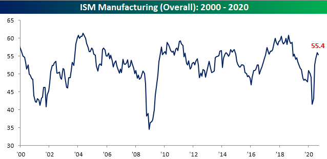
ISM Disappoints But Manufacturing Still Improving
The Institute for Supply Management’s reading on the manufacturing sector released this morning disappointed coming in at 55.4 compared to last month’s 56.0 level and expectations for a reading of 56.5. The decline marks the first time that the ISM reading on manufacturing was lower month over month since April and also runs contrary to strength in other recent manufacturing indices like the Chicago PMI or the five regional Fed readings. Granted, that is not to say it is a weak reading. At 55.4, the index still indicates manufacturing activity expanded in September for a fourth month in a row at a healthy rate similar to what was last seen in late 2018/January 2019.
The commentary section anecdotally paints a mixed but interesting picture of the economy. There was plenty of mention of improving sales and orders with some seemingly at very strong clips, but that wasn’t the case for everyone. One comment from the Transportation Equipment industry claimed that “Business is booming” while another comment from the Petroleum and Coal Products industry stated bluntly that they have yet to see any improvement. Others paint a more modest picture of the rate of improvement such as the comment from the Fabricated Metal Products and Paper Product industries. Those are perhaps more consistent with the headline index. While these comments paint a somewhat mixed picture as to whether or not and at what pace conditions are improving, one common theme appears to be supply chains trying to work out some kinks. There is mention of a range of topics concerning supply chains including longer lead times, price increases, shortages, and curbed production due to COVID quarantines.

The hard numbers seem to back these claims up. Breadth was a bit mixed in this month’s report with the indices for Production, New Orders, Customer Inventories, and Imports all falling month over month. Despite those changes, the same indices remain in expansion/contraction as last month. The only indices to remain in contraction are those for inventories (which is not necessarily a negative) and Employment (just barely).
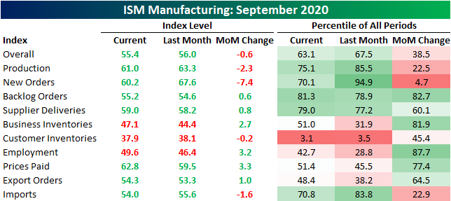
The 7.4 point decline in the index for New Orders was not as large at the 7.6 or 15.1 point declines in March and April, respectively, but it marked a substantial drop nonetheless which stands in the bottom 5% of all monthly moves. Granted one welcome difference between this most recent decline and the spring is at what level the decline came from. While those drops in March and April were indicative of sharp contractions in New Orders, the September reading still points to New Orders increasing at a healthy clip just at a slower rate than what was observed in August.

Given that New Orders continue to rise, the Backlog of Orders has likewise continued to rise. With manufacturing businesses continuing to have a full plate, the index for Backlog Orders rose to 55.2; the highest level since November of 2018.

Given the growing list of to-do’s, companies continued to increase production with that index continuing to sit in the upper quintile of all historical readings. At 61 versus 63.3 last month, though, the index does indicate that the improvements in production decelerated a bit from August. With the anecdotal evidence provided in the commentary section as well as the uptick to 59 in the Supplier Deliveries index (a reading well off the recent spike from earlier in the year but still at the high end of the historical range), there is at least some evidence that this slowed production improvement could be a factor of supply chain problems.


While production is improving and supply chains continue to face pressures, there still has not been much help on the employment front. The Employment index rose for a fifth straight month with this month’s reading of 49.6, but that also leaves it just shy of its first expansionary reading in 14 months. In other words, although the index is at multi-month highs, there continues to be more businesses reporting lower than higher levels of employment. The fact that it’s improving, though, is a welcome trend and one that could continue given the strong demand and shrinking inventories. Click here to view Bespoke’s premium membership options for our best research available.

How Current Returns Stack Up to History
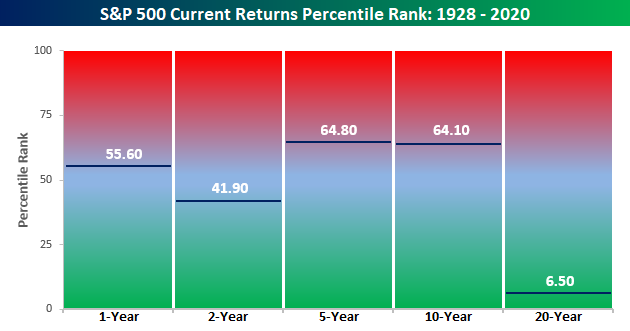
Even after September’s weakness, the S&P 500’s trailing 12-month total return stood at an impressive 14.9%. Given the events of the last 12 months, one could even say that performance is remarkable. What’s even crazier is that the S&P 500’s performance over the last 12 months is more than three times stronger than the 12 month period before that (+4.25%). The chart below compares the S&P 500’s annualized total returns over the last one, two, five, ten, and twenty years and compares that performance to the historical average return of the index over those same time periods.
The S&P 500’s historical average 12-month return is 11.7%, so the current 14.9% gain exceeds that average by more than three full percentage points. Over a two-year window, though, the S&P 500’s annualized return of 9.4% is more than a full percentage point below the historical average. Looking further out, the S&P 500’s trailing five and ten-year annualized return has been much stronger than average, which makes sense given the long bull market we were in. Over a 20 year window, though, the S&P 500 is only just starting to work off some of the declines from the dot-com bust and as a result, the 6.4% annualized gain is four and a half percentage points below the long-term average of 10.9%.

Below we show how the current performance of the S&P 500 in each of the time frames shown compares to all other periods on a percentile basis. The S&P 500’s performance over the last year ranks just below the 56th percentile of all other periods, while the two-year performance ranks just below the 42nd percentile. Even as the five and ten-year periods have seen well above average returns, they still rank in just the mid-60s on a percentile basis. The S&P 500’s ranking over a 20-year time period is a completely different story ranking in single-digits on a percentile basis. Even with the equity market right near record highs, the last two decades have been forgettable for US equities. Click here to view Bespoke’s premium membership options for our best research available.
New Pandemic Low for Jobless Claims With A But
Ahead of tomorrow’s Nonfarm Payrolls number, seasonally adjusted initial jobless claims were all around improved this week. Claims fell 36K to 837K. With the caveat of there being different seasonal adjustment methodologies pre and post-September, that marks a new low for the pandemic, though, that is still much higher than any readings prior to 2020. Adding yet another caveat to this data, this week the state of California—the most populous and usually the biggest contributor to claims—also announced a two-week pause in the processing and reporting of claims so that the state can update some of its processes and catch up on a backlog. In other words, while this week’s reading was strong, the most recent data for the state that has held one of the largest weights on the total number of claims was estimated.
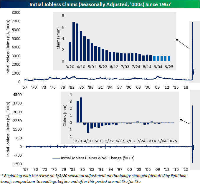
Non-seasonally adjusted claims were likewise lower this week, falling to 786.94K. That is the second time unadjusted claims have come in below 8,000K with an over 40K lower than the prior week. As with the adjusted number, that also marks a new low for the pandemic; just over 9K lower than the previous low of 796K from two weeks ago.

After remaining unchanged last week, continuing claims have also continued to fall with the seasonally adjusted reading falling below 12 million for the first time since the first week of April.

While regular state claims were lower, initial pandemic unemployment assistance claims rose by 34.5K. That increase offset the decline in regular state claims meaning the total between the two was unchanged from the previous week at 1.44 million. That is still around some of the lowest levels of the pandemic but is not quite at the same lows as regular claims alone. The same can be said for continuing claims. Total continuing claims (regular state claims plus PUA) rose to 24.3 million from 24 million in the most recent week. Again, in spite of the decline in regular state claims, that increase was thanks to a rise in PUA claims. In total, including all other programs like those for federal employees, veterans, extended benefits, and more, continuing claims for the week of September 12th stood at 26.53 million. That was an increase from 26.04 million the prior week which marked the lowest level of the pandemic. Click here to view Bespoke’s premium membership options for our best research available.

B.I.G. Tips – A Monumental Six Months
Bespoke’s Morning Lineup – 10/1/20 – Is This Thing On?
See what’s driving market performance around the world in today’s Morning Lineup. Bespoke’s Morning Lineup is the best way to start your trading day. Read it now by starting a two-week free trial to Bespoke Premium. CLICK HERE to learn more and start your free trial.
“However beautiful the strategy, you should occasionally look at the results.” – Winston Churchill
Japanese equities were unexpectedly halted for the day due to a trading glitch, but European and US equities are trading on the positive side of unchanged. US equities are indicated higher by more than half of a percent ahead of a very busy day of economic data and optimism over a new round of stimulus. How many times can the market rally on the same rumor?
Initial Claims are expected to come in roughly unchanged from last week while Continuing Claims are expected to drop modestly. Both Personal Income and Spending, on the other hand, aren’t expected to show nearly as much strength as their prior readings. Finally, the Markit US Manufacturing and ISM Manufacturing PMIs are expected to show small improvements versus August’s readings.
Be sure to check out today’s Morning Lineup for a rundown of the latest stock-specific news of note, market performance in the US and Europe, Markit Manufacturing data from around the world, trends related to the COVID-19 outbreak, and much more.

The first big economic report of the month will be the ISM Manufacturing report at 10 AM eastern. Already, we have seen signs of strength in the manufacturing sector based on the positive regional Fed manufacturing surveys, but one of the most closely correlated indices to the ISM Manufacturing report is the Chicago PMI. As noted in last night’s Closer report, the r-squared of the monthly levels for each report is 0.76. Based on the results of yesterday’s release which came in well above expectations (62.4 vs 52.0) and was the strongest relative to expectations since October 2013, today’s ISM Manufacturing report should be positive as well. Even with this month’s increase, though, the Chicago PMI remains well below its peak levels of the prior expansion.

Adding together July’s strong gain, a modest decline in August, and now September’s surge, the Chicago PMI has seen its largest three-month increase in the history of the survey. With a gain of 25.78 points during that period, the only other period that was even close in terms of the magnitude of the gain was exactly 40 years ago in the three-months ending September 1980 (+24.29). Looking at the chart, what’s notable about September 1980 and many of the other large three-month rallies in this index is that they occurred right in the early stages of an economic expansion. That’s the good news. The one but, and there’s always a but, is that the 1980 period, which was the period with the most similar three-month increase to now, was quickly followed by another recession. Let’s hope we don’t see double-dip this time around too.

The Bespoke 50 Top Growth Stocks — 10/1/20
Every Thursday, Bespoke publishes its “Bespoke 50” list of top growth stocks in the Russell 3,000. Our “Bespoke 50” portfolio is made up of the 50 stocks that fit a proprietary growth screen that we created a number of years ago. Since inception in early 2012, the “Bespoke 50” has beaten the S&P 500 by 158.8 percentage points. Through today, the “Bespoke 50” is up 302% since inception versus the S&P 500’s gain of 143.2%. Always remember, though, that past performance is no guarantee of future returns. To view our “Bespoke 50” list of top growth stocks, please start a two-week free trial to either Bespoke Premium or Bespoke Institutional.

Daily Sector Snapshot — 9/30/20
B.I.G. Tips — S&P 500 October Intra-Month Seasonality
Bespoke Market Calendar — October 2020
Please click the image below to view our October 2020 market calendar. This calendar includes the S&P 500’s average percentage change and average intraday chart pattern for each trading day during the upcoming month. It also includes market holidays and options expiration dates plus the dates of key economic indicator releases. Start a two-week free trial to one of Bespoke’s three research levels.

What Have Democratic Sweeps Meant for the S&P 500?
Headed into the first presidential debate Tuesday night, betting markets (ElectionBettingOdds.com) placed Democratic candidate Joe Biden as the slight favorite to take the White House in November. The debate resulted in Biden gaining another 5 percentage point chance of winning the Presidency. As of this morning, Biden’s odds to win are at 59.8% versus Trump’s odds of 38.9%. Additionally, Democrats are slight favorites to win control of the Senate (58.4% to 41.5%) and big favorites to maintain the House (82.8% to 17.1%). Given these odds, in the chart below we show the average performance of the S&P 500 from the three months before Election Day through three months after Election Day for all election years post-WWII that resulted in a sweep of the executive and legislative branch by the Democrats.
As shown, on average the S&P 500 has been on the decline in the weeks leading up to Election Day, though in the days just before the Election there has been a small rally that sharply reverses once the results come in. After the initial post-Election drop, the market has trended a bit higher, but by three months after the Election, it has only found itself around the same levels as Election Day; on average a 2.6% loss versus where the index stood three months prior.
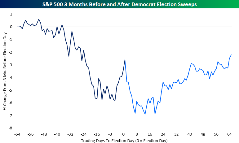
The composite shown above is comprised of six different years: 1948, 1960, 1964, 1976, 1992, and 2008. While on average the S&P 500 has traded lower, it is not necessarily a sure-fire thing. For example, 1948 and 2008 were the only years that saw the S&P 500 trade and stay significantly lower in the wake of the election. In 1976, there was similarly a sell-off in the immediate aftermath of the election, but the index did make its way back up to the highs of that six-month time frame later on albeit no new high was put in place. Meanwhile, 1960, 1964, and 1992 all saw the S&P 500 run higher after the election even despite some periods of consolidation after initial moves higher. In our B.I.G. Tips report from Tuesday, we show these same charts for all Presidential election years post WWII including a look at the average performance given every potential election outcome. Click here to see the report with a two-week free trial to Bespoke Premium.
