Chart of the Day: Diverging Paths of Data
Today’s Chart of the Day compares the recent paths of economic surprise indices for the US and Europe and how they have changed in the last several weeks.
To continue reading our Chart of the Day, enter your info below and start a free Bespoke research trial. During your trial, you’ll also receive access to our model stock portfolios, daily market alerts, and weekly Bespoke Report newsletter.
[thrive_leads id=’59052′]
Dynamic Upgrades/Downgrades: 3/2/16
The Closer 3/1/16 – “ISM Pushes Up Bond Yields As Highways Roll Out”
Looking for deeper insight on global markets and economics? In The Closer tonight we recap two big data prints from today (ISM Manufacturing and Construction Spending) as well as a survey of bond yields and the Treasury curve.
The Closer also includes its standard charts, large volume and price movers in the US equity market, and Bespoke’s Market Timing Model. The Closer is one of our most popular reports, and you can sign up for a trial below to see it free for the next two weeks!
[thrive_leads id=’58717′]Underlying Breadth Hits 2016 Highs
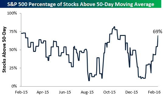
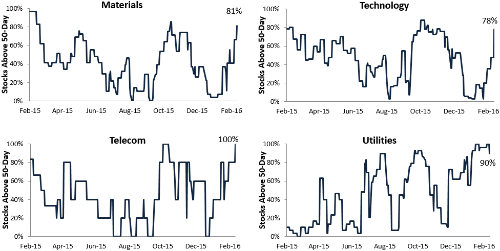
Today’s 2.39% rally for the S&P 500 was its best start to March EVER. The index is now up nearly 10% off its intraday lows from February 11th, and underlying breadth has definitely strengthened significantly. Below is a chart showing the percentage of stocks in the S&P 500 trading above their 50-day moving averages. As of the close today, 69% of stocks in the index were back above their 50-days. That’s the highest reading seen since late 2015, and it’s a healthy sign for a market that has been unhealthy for quite some time.
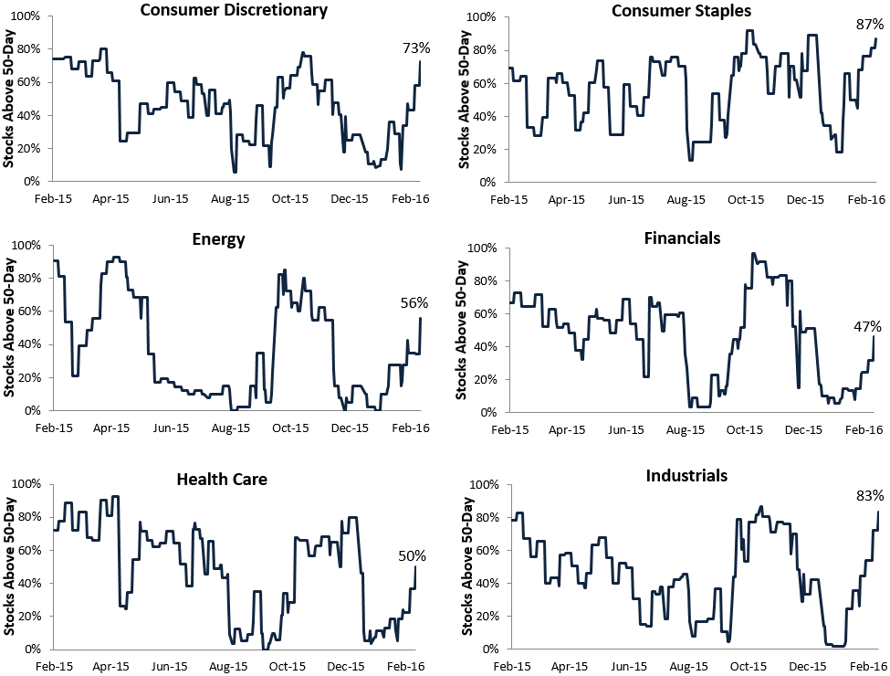
Nine of ten sectors now have at least 50% of their stocks trading above their 50-day moving averages. The Financial sector is the one holdout with a reading of just 47%.
One of the most notable sectors in terms of breadth right now is Industrials, which has 83% of its stocks above their 50-days. The Industrials sector has been a serial underperformer over the past 18 months due to weakness in global manufacturing readings. But while still weak, manufacturing readings of late have actually been coming in better than expected in the U.S., and it has many investors looking at a sector like Industrials and thinking that the turn might be here.
Bespoke Stock Scores: 3/1/16
ETF Trends: Fixed Income, Currencies, and Commodities – 3/1/16
B.I.G. Tips – High Yield Spreads Falling to Earth
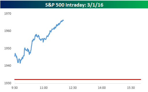
Chart of the Day: Up 1.5%+ at Noon
The S&P 500 rallied 1.76% in the first two and a half hours of trading today for its best morning since 8/27. In today’s Chart of the Day, we take a look at days where the S&P 500 was up 1.5% or more at noon and how the index performed for the remainder of the day.
To continue reading our Chart of the Day, enter your info below and start a free Bespoke research trial. During your trial, you’ll also receive access to our model stock portfolios, daily market alerts, and weekly Bespoke Report newsletter.
[thrive_leads id=’59052′]
This Stock Just Broke Out of Downtrend
The stock market’s recovery off the February lows has been rather swift, and we’re starting to see a number of stocks break out of long-term downtrend channels. Below we highlight one of those stocks, which after trading in a downtrend since last October, has broken above the top of its downtrend channel. When stocks break out of their downtrends, we follow them closely and look for an attractive entry point. The top of the prior downtrend channel should now act as support, and if the stock tests that support and holds, it’s time to enter a trade on the long side.
Please enter your email address to see which stock we’re referencing in the chart below.
[thrive_lead_lock id=’63349′]
[/thrive_lead_lock]
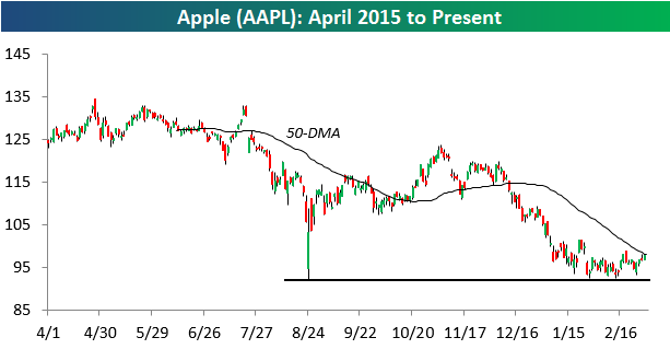
12+ Months Since Last Apple (AAPL) 52-Week High
It has been a long time since Apple (AAPL) made a new 52-week high. In 2014, the stock made new highs on a regular basis, but in early 2015 on February 23rd, the stock closed at $133, and that level hasn’t been touched since. Below is a historical chart for Apple (AAPL) showing streaks of trading days without hitting a new 52-week high. Its current streak of 256 trading days stands out on the chart, but the stock actually had a longer streak without making a new 52-week high in 2013, and it got above 400 trading days during the financial crisis bear market.
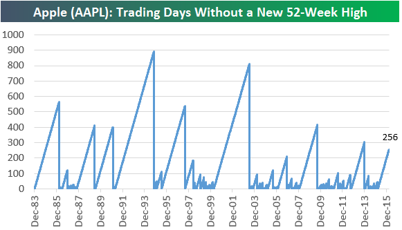
After trending lower in the second half of 2015, Apple appears to be forming a base with its intraday low from 8/24/15 acting as its floor. It has tested and held those 8/24 multiple times this year, and gains today have left it less than $1 below its 50-day moving average. For now, if you own Apple, you’re holding it. If the stock can break back above its 50-day and then move above its January highs, you’ll see more investors turn bullish on the name again.