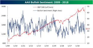
Individual Investors Turn Positive
The AAII survey on individual investor sentiment released this morning saw a more positive turn after last week’s extremely bearish reading. The post-Thanksgiving gains experienced so far this week helped to boost sentiment to 33.88% from last week’s low 25.25%. This is slightly lower than what we have seen most of the year, but much more in line with recent months.
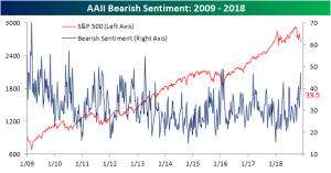
Last week saw the highest reading for bearish sentiment since February 2016. Bearish sentiment for this week fell to 39.5% from 47.1%. While this is certainly a large drop, it is still at an elevated level that hasn’t been seen since the spring.
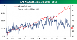
Neutral sentiment saw a small decline from 27.61% to 26.64% with this loss most likely going towards the bullish camp.
Important to note about this week’s survey is that the impact of Fed Chair Powell’s remarks are likely to not be seen due to timing. With the speech occurring mid-day yesterday, most respondents had already reported. If yesterday’s price action in response to the speech is any indication, we should expect to see some fairly large changes benefiting bullish sentiment in next week’s survey. Also between now and then will be the G20, and more importantly, the meeting between President Trump and Chinese President Xi Jinping. This is yet another would-be catalyst that investors are watching as a tell on where trade policy will go. Some type of agreement between the two presidents could supplement the probable increase in bullish sentiment next week.
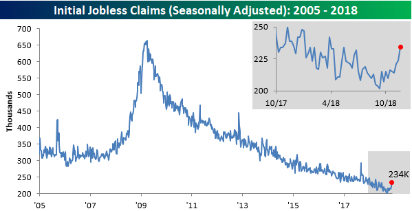
Jobless Claims Hit a Six-Month High
Six-month high for jobless claims? That’s something we haven’t been able to say in well over a year since hurricanes battered the US late last summer. Today’s report on jobless claims showed an increase to 234K from last week’s level of 224K and expectations for 220K. The last time claims were this high was back in mid-May, and the last time they were higher was in late March! For years now, any time the strength and resiliency of the US economy has come into question, the downward trend of jobless claims has acted as a security blanket. After today’s report, though, the yarn may be starting to fray a little. Even at 234K, claims are still low by historical standards, but they are just higher than what we have become accustomed to in recent months.
This week’s reading of 234K ended the streak of weeks where claims were at or below 225K at 20, which was just two shy of the 22-week record in 1969. While that streak has ended, the 60-week streak of readings at or below 250K remains intact, as does the record streak of 195 straight weeks where claims have been at or below 300K. When and if these streaks start to fall, it will be a time of much greater concern.
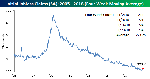
The four-week moving average also saw a pretty sizable increase this week, rising from 218.5K up to 223.25K. That 4.75K increase is the largest since mid-May, which was also the last time weekly claims were this high. It has now been eleven weeks since this indicator made its last cycle low of 206K, and the last time we were this far off a low was in September 2017.
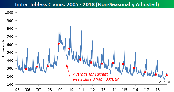
With this week’s report covering the week of Thanksgiving and the prior week being Veterans Day, there is some talk that the numbers this week may have been skewed a bit. Only time will tell on that front, but we would note that on a non-seasonally adjusted (NSA) basis, claims were not as bad. At 217.8K, this week’s NSA reading was nearly 140K below the average for the current week of the year dating back to 2000, and the last time they were this low in this specific week was in 1968.
Bespoke Morning Lineup – Jobless Claims Lifting
For much of the last several years, whenever there has been any doubt regarding the strength of the recovery, jobless claims were always there to act as a security blanket. This morning’s report, though, has frayed the yarn slightly. While economists were expecting first time claims to come in at 220K, the actual reading was 234K, which was the highest level in six months! To be sure, 234K is still low by historical standards, but it’s not the type of sub 225K reading that we’ve been used to seeing lately. Read today’s Bespoke Morning Lineup below for major macro and stock-specific news events, updated market internals, and detailed analysis and commentary:
Bespoke Morning Lineup – 11/29/18
Yesterday’s 2%+ gain in the major US averages was a welcome relief for bulls and helped to push the S&P 500 into positive territory for the month. Since the lows of the Financial Crisis in March 2009, yesterday’s gain was the 66th time that the S&P 500 has gained more than 2% in a single day. Of those prior occurrences, the index’s average performance the following day was a decline of 0.1% with positive returns just under half of the time.

Start a two-week free trial to Bespoke Premium to see today’s full Morning Lineup report. You’ll receive it in your inbox each morning an hour before the open to get your trading day started.

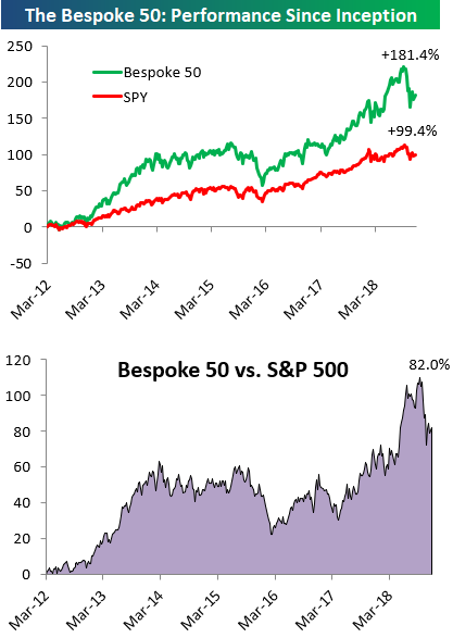
the Bespoke 50 — 11/29/18
Every Thursday, Bespoke publishes its “Bespoke 50” list of top growth stocks in the Russell 3,000. Our “Bespoke 50” portfolio is made up of the 50 stocks that fit a proprietary growth screen that we created a number of years ago. Since inception in early 2012, the “Bespoke 50” has beaten the S&P 500 by 82.0 percentage points. Through today, the “Bespoke 50” is up 181.4% since inception versus the S&P 500’s gain of 99.4%. Always remember, though, that past performance is no guarantee of future returns.
To view our “Bespoke 50” list of top growth stocks, click the button below and start a trial to either Bespoke Premium or Bespoke Institutional.
The Closer — Powell, BoE On Brexit, New Home Sales, GDP Revisions, EIA — 11/28/18
Log-in here if you’re a member with access to the Closer.
Looking for deeper insight on markets? In tonight’s Closer sent to Bespoke Institutional clients, we’ve got a lot to talk about. While markets reacted very dovishly to comments from Fed Chair Powell this morning, we see a more nuanced view. We also review the BoE’s forecast of a range of Brexit scenarios today before assessing economic data. New home sales missed but September numbers were revised up, offsetting the miss, while GDP was also revised today. We finish up with a review of weekly EIA petroleum inventory numbers.

See today’s post-market Closer and everything else Bespoke publishes by starting a 14-day free trial to Bespoke Institutional today!
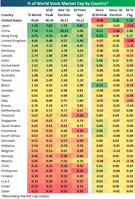
Country Stock Markets as a Percent of World
Below is a look at the percentage of total world stock market cap that each country’s stock market makes up. For each country, we show its percentage of world market cap as of today, as it stood on 9/20 when the S&P 500 made its last all-time high, as it stood on election day 2016, and as it stood 10 years ago.
The US currently makes up 39.81% of world stock market cap, which is more than 30 percentage points more than the next closest country — Japan — at 7.76%.
Note that Japan has moved into second place after being well behind China in November 2016. While the US has gained more than 3 percentage points of global market cap share since Trump was elected, China has lost a significant amount — falling from 10.21% down to 7.54%. At least based on this measure, Trump’s trade fight with China has benefited the US at the expense of China.
Hong Kong remarkably makes up 6.75% of world stock market cap, which is well ahead of the UK (4.41%), France (3.14%), Germany (2.83%), and Canada (2.74%).
Since the 9/20 peak for the S&P 500, the US has lost 0.49 percentage points of share, while China, Hong Kong, and Brazil have seen the biggest gains, so things have tightened a little bit between the US and China during the recent sell-off here in the US.
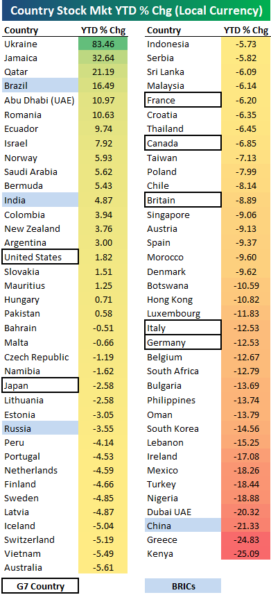
2018 Year-to-Date Country Stock Market Returns
Below is an updated look at year-to-date stock market returns (in local currency) for 75 countries around the world. 2018 has turned into a red year for equities as the average country is now down 3.75% YTD. Just 20 countries (26.7%) are in the green for the year, while 55 are in the red.
As shown, Ukraine ranks first with a gain of 83.46% (remember these returns are in local currency), followed by Jamaica (+32.6%), Qatar (+21.2%), and Brazil (+16.59%). Abu Dhabi (UAE) and Romania are the only other countries up 10%+ on the year.
Of the G7 countries, the US ranks first with a minuscule gain of 1.82%. The US is also the only G7 country in positive territory for the year. Japan ranks 2nd best with a YTD decline of 2.58%, followed by France at -6.2%, Canada at -6.85%, and Britain at -8.89%. Italy and Germany rank at the bottom of the G7 with double-digit percentage declines of 12.5%.
Of the “BRICs”, Brazil ranks first with a gain of 16.49%, followed by India at +4.87%. Russia is down 3.55%, while China is down 21.33%. China is actually the 3rd worst out of the entire list of 75 countries, and one of just four countries down 20%+. Only Kenya and Greece have done worse this year.
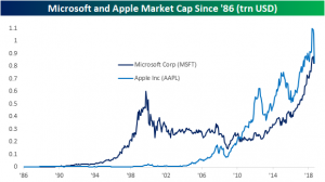
Microsoft (MSFT) Back on Top — Largest Companies in the S&P 500
Yesterday we noted that Microsoft (MSFT) and Apple (AAPL) were once again battling it out for the title of world’s largest company by market cap. As of early afternoon trading today, Microsoft (MSFT) has moved back into the lead. Below is a table showing the 35 largest companies in the S&P 500.
Microsoft (MSFT) sits at #1 with a market cap of $856.5 billion, followed closely by Apple (AAPL) at $850.6 billion. Amazon.com (AMZN) isn’t far behind in third place with a market cap of $804.1 billion, while Alphabet (GOOGL) ranks fourth at $746.7 billion. Berkshire Hathaway (BRK/B) rounds out the top five at $531.4 billion.
Earlier in the year, Facebook (FB) ranked in the top five with a market cap above $500 billion, but the company has lost 23.7% year-to-date at this point, leaving it in 7th place behind Johnson & Johnson (JNJ).
JP Morgan (JPM), Exxon Mobil (XOM) and Walmart (WMT) rank 8th through 10th.
One name conspicuously absent from the list of largest companies is General Electric (GE). At a share price of just $7.60, GE’s market cap has fallen all the way down to $66 billion. As recently as October 8th, the stock had a market cap of $120 billion, but a 44% decline since then has wiped out nearly half of its value. Pretty remarkable.
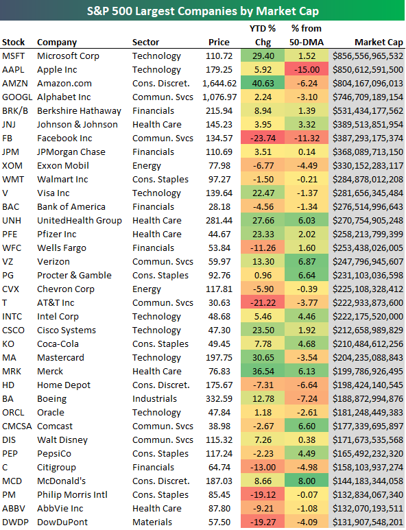
Chart of the Day: Walgreens (WBA) Offers Medicine for Sell-Offs
Principals of Preferreds
Below is an excerpt from today’s Fixed Income Weekly, which is sent out each Wednesday to recap and analyze developments in fixed income markets both in the US and around the world. Sign up for Bespoke Institutional with our Annual Outlook special to read it today and beyond.
From a price return perspective, preferred share ETFs have been in a world of hurt. Major preferred share ETFs like VRP (Invesco Variable Rate Preferred ETF), PFF (iShares US Preferred Stock ETF), PGX (Invesco Preferred ETF), and PGF (Invesco Financial Preferred ETF) are at or near 52-week lows. Worse, price has gone nowhere since 2014, with prices down almost 6% since the inception of VRP back in May of 2014. That’s pretty brutal.
Fortunately for fixed income investors with preferred exposure, price is not the driver of returns for the product. As shown in the chart below, despite the horrible price returns, total returns on average across all four ETFs listed above are a solid 21% since 2014. Interest returns are significantly higher at more than 26%. Moreover, while day-to-day volatility is almost entirely a function of the price return, interest return is the overwhelming driver of aggregate total returns. As with other fixed income ETFs, failing to account for interest accruals in the form of dividends is a critical mistake that can lead to missed opportunities.