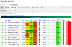
Trend Analyzer – 1/3/19 – Room For Improvement
It may be a new year, but things are still oversold as seen in our Trend Analyzer as every one of the major index ETFs remain oversold. Granted, since last week’s post-Christmas rally, things have moved well out of the extremely oversold range that all of these ETFs had been trading within in recent weeks. For the first time in a while as well, all of these names we track are seeing green over the past five days. Ironically, the Micro-cap ETF (IWC), which had been the most beaten down by the end of 2018, has seen some capitulation and is now seeing the biggest gains of the group. IWC is up the most both over the past five days at 3.89% and for the first trading day of the year yesterday at +1.7%. In both respects, it leads its peers by over a percentage point.
While we’ve seen a bounce over the last week, it must be noted that each of these ETFs are still firmly in downtrends. Additionally, they are all still well below their 50-DMAs. So bulls still have their work cut out to improve the long-term picture.
Fixed Income Weekly – 1/2/19
Searching for ways to better understand the fixed income space or looking for actionable ideals in this asset class? Bespoke’s Fixed Income Weekly provides an update on rates and credit every Wednesday. We start off with a fresh piece of analysis driven by what’s in the headlines or driving the market in a given week. We then provide charts of how US Treasury futures and rates are trading, before moving on to a summary of recent fixed income ETF performance, short-term interest rates including money market funds, and a trade idea. We summarize changes and recent developments for a variety of yield curves (UST, bund, Eurodollar, US breakeven inflation and Bespoke’s Global Yield Curve) before finishing with a review of recent UST yield curve changes, spread changes for major credit products and international bonds, and 1 year return profiles for a cross section of the fixed income world.
This week we illustrate just how carried away markets have gotten in pricing a Fed pause..

Our Fixed Income Weekly helps investors stay on top of fixed income markets and gain new perspective on the developments in interest rates. You can sign up for a Bespoke research trial below to see this week’s report and everything else Bespoke publishes free for the next two weeks!
Click here and start a 14-day free trial to Bespoke Institutional to see our newest Fixed Income Weekly now!
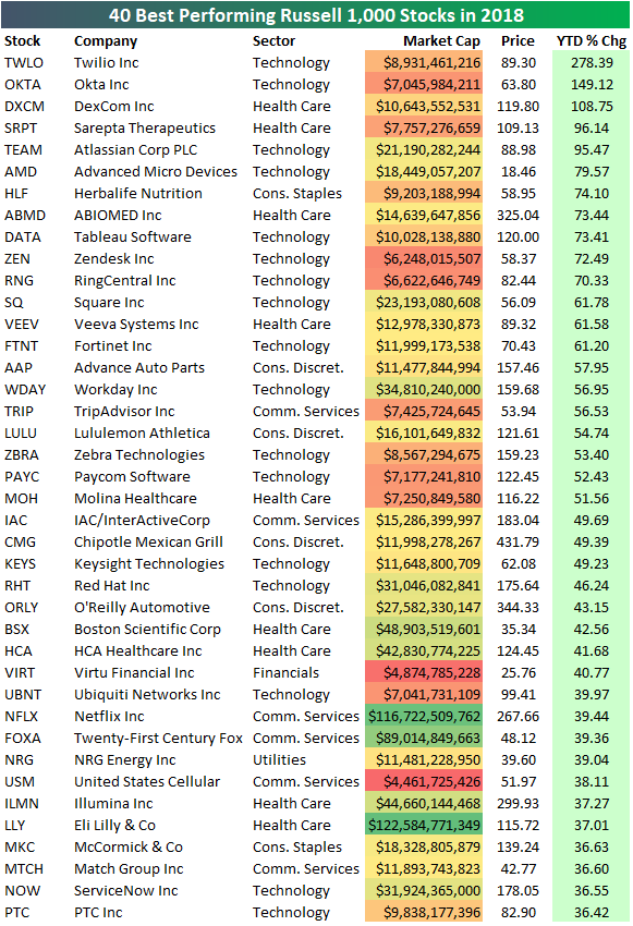
The Best Performing Stocks of 2018
The average stock in the large-cap Russell 1,000 index fell 9.18% in 2018. Nine percent of stocks in the index gained more than 20% in 2018, while 35% of stocks fell 20% or more.
Below is a list of the 40 best performing stocks in the index in 2018. Twilio (TWLO) took the top spot with a gain of 278.39%, followed by Okta (OKTA) in second with a gain of 149.12%. The only other Russell 1,000 stock that posted triple-digit percentage gains in 2018 was DexCom (DXCM) at +108.75%. Note that 13 of the 14 best performers came from either the Health Care or Technology sectors. Herbalife (HLF) is the only non-Health Care or Technology stock that cracked the top 14 with a gain of 74.1%.
Netflix (NFLX) and Eli Lilly (LLY) are the only two stocks with market caps greater than $100 billion that made the list. NFLX posted a 2018 gain of 39.44%, while LLY gained 37.01%.
These performance numbers ended up being a far cry from the huge gains that dozens and dozens of stocks were sitting on back in September.
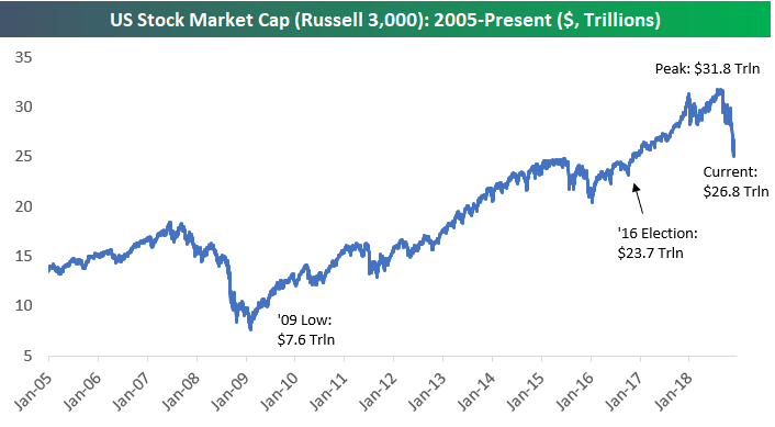
US Stock Market Cap Drops $2.5 Trillion in 2018
Below is a look at the historical market cap of the US equity market using the Russell 3,000. The Russell 3,000 is a combination of the Russell 1,000 large-cap index and the Russell 2,000 small-cap index, and it covers roughly 98% of total US market cap.
In 2018, US market cap fell $2.5 trillion from $29.3 trillion at the start of the year to $26.8 trillion at year end. At the peak in September 2018, US market cap was at $31.8 trillion, so we’ve seen a loss of $5 trillion in market cap from the highs.
On Election Day 2016, market cap stood at $23.7 trillion, so we’ve seen a gain in market cap of $3.1 trillion since Trump was elected. Since Trump took office in January 2017, we’ve seen an increase in market cap of roughly $1.47 trillion.
As shown below, at the lows in 2009, US market cap had gotten all the way down to $7.6 trillion!
Bespoke Stock Scores — 1/2/19
Chart of the Day: Yield Curve Heading For the Teens
Bespoke’s Global Macro Dashboard — 1/2/19
Bespoke’s Global Macro Dashboard is a high-level summary of 22 major economies from around the world. For each country, we provide charts of local equity market prices, relative performance versus global equities, price to earnings ratios, dividend yields, economic growth, unemployment, retail sales and industrial production growth, inflation, money supply, spot FX performance versus the dollar, policy rate, and ten year local government bond yield interest rates. The report is intended as a tool for both reference and idea generation. It’s clients’ first stop for basic background info on how a given economy is performing, and what issues are driving the narrative for that economy. The dashboard helps you get up to speed on and keep track of the basics for the most important economies around the world, informing starting points for further research and risk management. It’s published weekly every Wednesday at the Bespoke Institutional membership level.
You can access our Global Macro Dashboard by starting a 14-day free trial to Bespoke Institutional now!

Morning Lineup – Not a Good Start
Not a good start to the year. While futures are off earlier lows, the S&P 500 is poised to kick the year off with a decline of more than 1%. The culprit behind today’s weakness is poor economic data out of China and Europe. On the US front, things have been quiet…so far.
Read today’s Bespoke Morning Lineup below for major macro and stock-specific news events, updated market internals, and commentary.
Bespoke Morning Lineup – 1/2/19
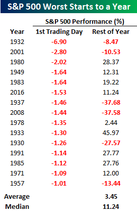
With futures indicating a decline of about 1.65% at the open, today’s start to 2019 could go down as the 16th time that the S&P 500 has kicked off a year with a first day decline of more than 1%. You may recall that the last such occurrence was in 2016 when stocks kicked off the year falling by 1.53% on the first trading day. The rest of that year wasn’t so bad as the S&P 500 went on to rally 11.24% from the first day’s close through year-end. That 11.24% advance also just happens to be the median rest of year gain that we have seen following prior years when the S&P 500 fell more than 1% on the first trading day of the year.
Besides 2016, the next two most recent occurrences where the S&P 500 fell more than 1% to kick off the year weren’t as friendly to the bulls. In 2008, the S&P 500 dropped 1.44% to kick off the year and proceeded to fall another 37.58% through year-end! Then, back in 2001, the S&P 500 kicked off the year with a decline of 2.8%. Following that sharp drop, the FOMC announced a surprise 50 bps rate cut from 6.5% down to 6.0% the very next day. Back then when rates were above 6%, the FOMC had plenty of more ‘ammo’ to ease further, but in the end, it didn’t seem to help as the S&P 500 fell another 10.5% through year-end, and the economy peaked and fell into recession in March.
Start a two-week free trial to Bespoke Premium to see today’s full Morning Lineup report. You’ll receive it in your inbox each morning an hour before the open to get your trading day started.

B.I.G. Tips – 2018 Equity Market Snapshot
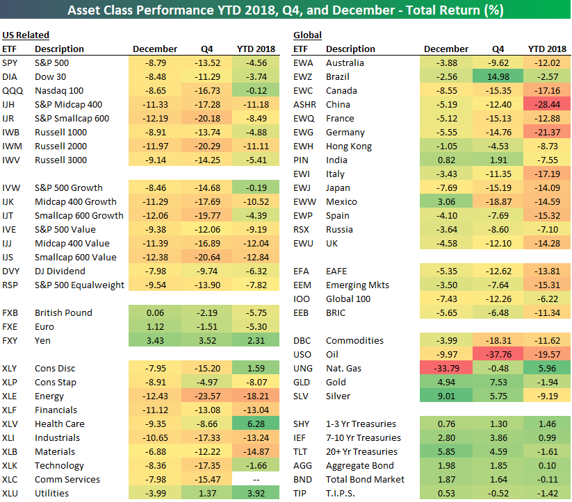
2018 Asset Class Total Return Performance — Bespoke’s ETF Matrix
Below is a final look at 2018 total returns across asset classes using our ETF matrix. For each ETF, we show its December, Q4, and full year 2018 total return.
The S&P 500 (SPY) finished 2018 down 4.56% on a total return basis after falling 13.52% in Q4 and 8.79% in December. The tech-heavy Nasdaq 100 (QQQ) fell 0.12% on the year after dropping 16.73% in Q4. The small-cap Russell 2,000 (IWM) fell 11.11% on the year, while mid-caps (IJH) fell just a bit more at -11.18%. The Russell 2,000 was down more than 20% in Q4 alone.
Looking at sectors, Health Care (XLV) ended up performing the best in 2018 with a total return of +6.28%. Energy (XLE) was the biggest loser with a decline of 18.21%.
Outside of the US, China (ASHR) fell the most in 2018 with a drop of 28.44%. Germany (EWG) was the only other country in our matrix that fell more than 20% on the year. Brazil (EWZ) did the best with a decline of just 2.57% after rallying 14.98% in Q4.
The commodities ETF (DBC) was down 11.62% in 2018 due to oil’s drop of 19.57%. In Q4 alone, the oil ETF (USO) fell 37.76%. Precious metals helped counter oil’s Q4 declines by gaining 5%+. The gold ETF (GLD) was up 7.53% in Q4, which left it down 1.94% on the year.
Finally, Treasury ETFs rallied nicely in December and over the entire fourth quarter, but the “Total Bond Market” ETF (BND) still finished the year slightly in the red at -0.11%. The “Aggregate Bond” ETF (AGG) finished just barely in positive territory at +0.10%. The popular 20+ Year Treasury ETF (TLT) rose 5.85% in December, but it was still down 1.61% for the full year on a total return basis.